By Catherine Austin Fitts
My “go to” website for technical analysis of precious metals, the US dollar & the US stock market is Rambus Chartology, where Rambus (that’s his handle – he’s the founding technical analyst) leads a discussion with extensive charts of what the markets are saying.
In January 2016, Rambus launched his quarterly Solari Report with a Blockbuster Chartology. You can find links to the entire series of quarterly and annual Blockbuster Chartologies at the end of this latest piece.
One of the reasons that Rambus is so good at his craft is that he focuses on “staying on the right side of the major trend.” The challenge of doing so at this time is that it is tempting to look for bottoms or to assume that the trend upwards in the US dollar or stock market may be over. However, Rambus consistently brings us back to the discipline of the Chartology. What does price tell us? As he describes so aptly, we are dealing with psychological warfare.
Sitting back once each quarter to get this perspective offers invaluable insight. So, here we go for the 2nd Quarter 2020 Blockbuster Chartology!
Blockbuster Chartology Quarterly Report
By Rambus
~ 2nd Quarter 2020 Wrap Up ~
Precious Metals Complex : The Big Picture
From the March 23rd low in the PM complex we’ve enjoyed the first easy part of this rally that should have many years to run yet. Every bull market will consist of an impulse move followed by a consolidation period, rinse and repeat until the bull market ends with some type of reversal pattern. Normally in a secular bull market the turning points will generally be very large to buildup the energy to advance to new highs.
The current 2nd leg up in the secular PM complex bull market actually began in January of 2016 after the first leg up ran from 2000 to 2011. There was a cyclical bear market within the secular bull market that ran from the 2011 high to the January 2016 low. It’s important to understand which part of a bull market one is in as to not get confused on what may lay ahead.
Tonight I would like to show you some long term quarterly line charts that I use when looking for big chart patterns that usually show up at important long term reversal points that can take years to complete. I usually only post these charts just a couple of times a year as change comes very slowly but when change does come it’s important to pay close attention because the change usually represents a major trend change.
Keep in mind when looking at these long term quarterly line charts that only the quarterly closing price is used which makes the chart patterns not very symmetrical looking. When I do spot a long term chart pattern on the quarterly line chart I will switch it over to a bar chart which will make the patterns a little more clear. Again, it is the major trend we want to trade with unlike a salmon swimming upstream using up all of its energy before it reaches the spawning grounds.
When looking at these charts to follow we still have over 3 weeks of trading yet before these quarterly line charts complete their 2nd quarter results which will then be put into stone. Also, since these are line charts you will be able to see more clearly reverse symmetry. How a stock goes down is often how it can go back up over that same area, which can play an important role in understanding the potential sweet spots where the price action can easily move with little in the way of resistance.
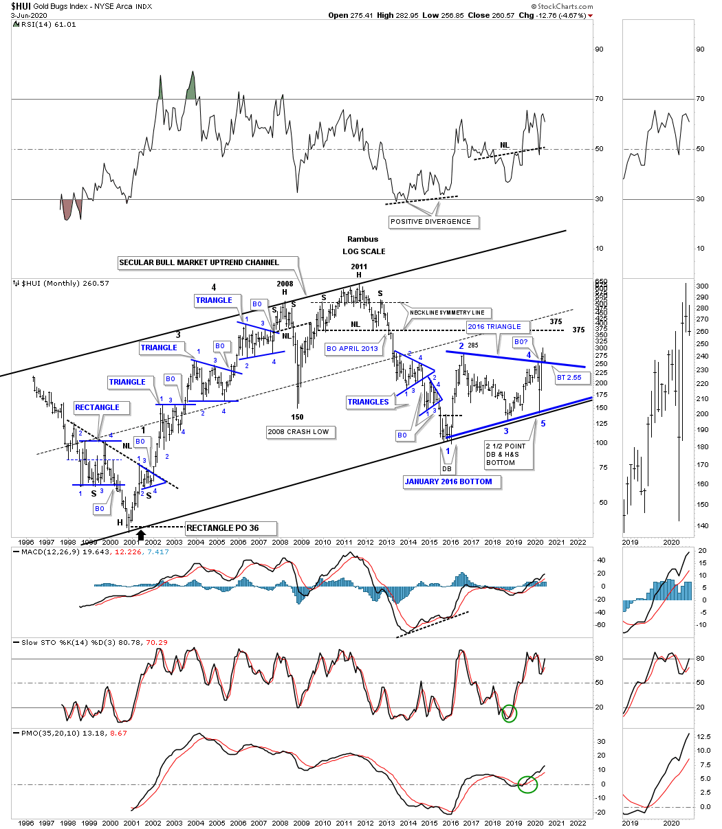
This is the HUI secular 2000 bull market uptrend channel that I will use as reference to the quarterly line charts to follow.
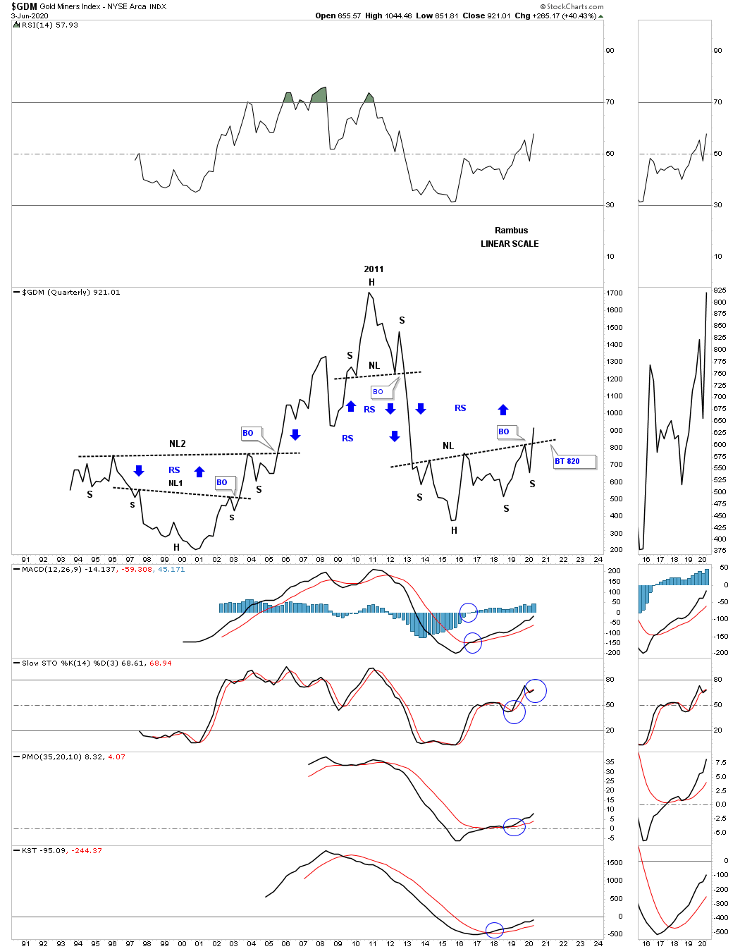
Lets start with the quarterly line chart for the GDM which begins in the early 1990’s. Keep in mind we are just looking for big chart patterns. It took almost 10 years to complete the double H&S bottom which launched the first leg of the secular bull market that ended at the 2011 high. That first leg of the secular bull market ended with the formation of a very symmetrical multi year H&S top, not so much on this quarterly line chart, but on a bar chart. That H&S top led to the bear market that ended at the January 2016 low. From that low the GDM carved out a 7 year H&S bottom reversal pattern with the long term breakout taking place this quarter. The blue arrows show you how reverse symmetry looks. The reason reverse symmetry works is because there were no big consolidation patterns that were made during the long term rallies and declines. If you look at the bear market decline out of the 2011 H&S top you can see a straight line down without any quarterly rallies. Now look at the current breakout taking place above the neckline. As you can see there is little in the way of slowing down any rally until the price action reaches the 2011 H&S top neckline.
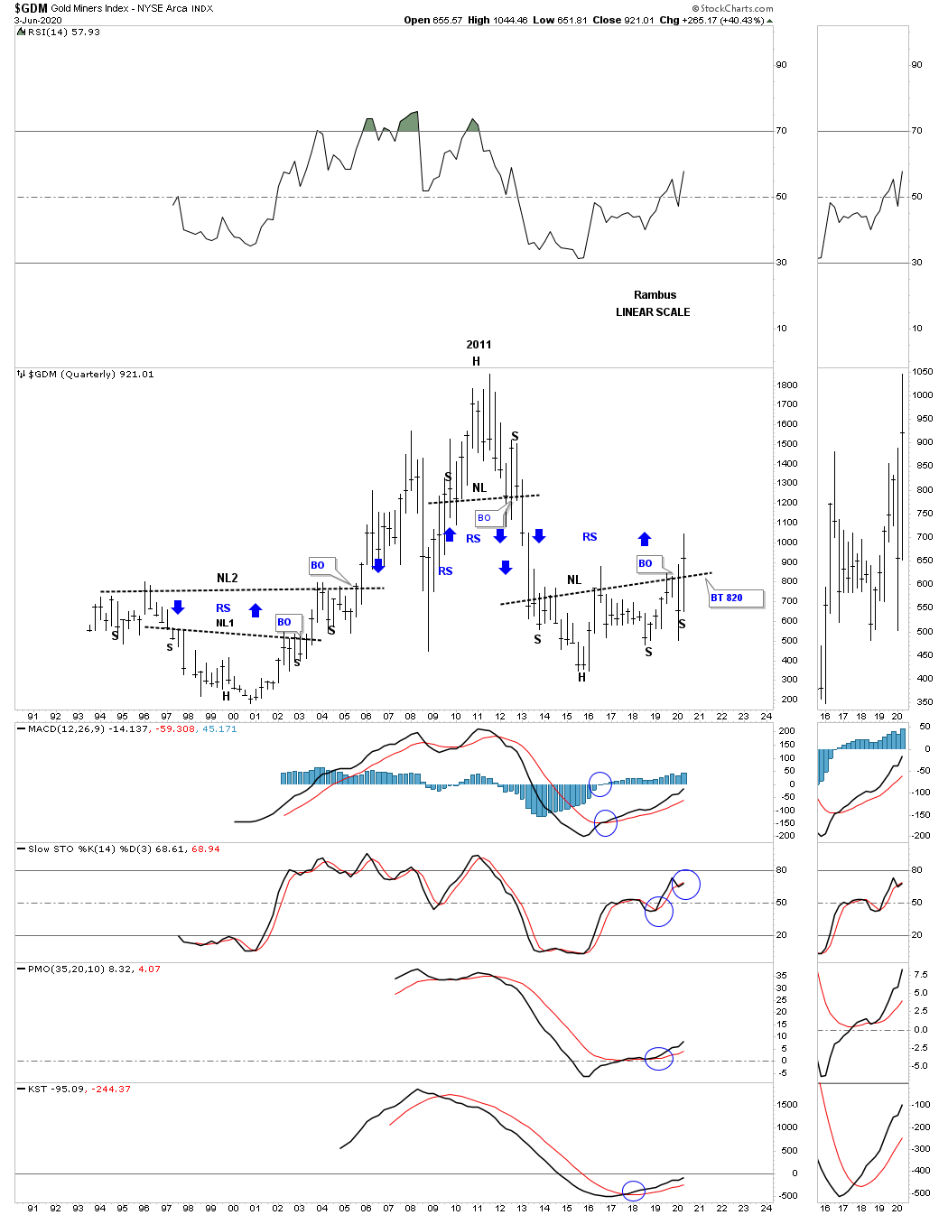
I’m going to show you the exact same chart as the one above but this will be a bar chart so you can see how these two compliment each other.
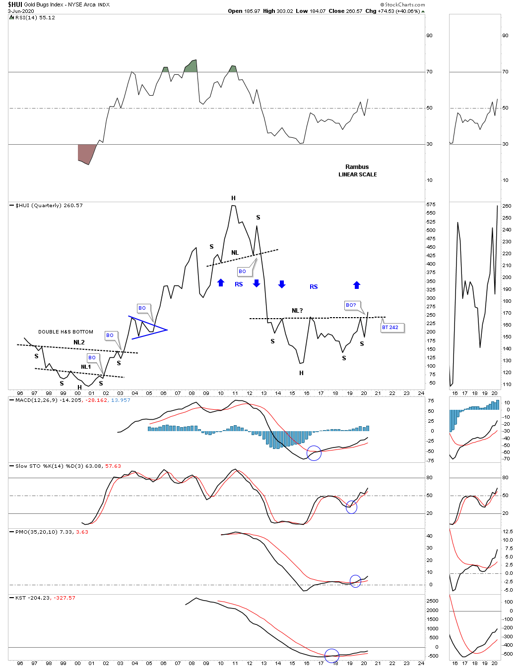
Next is the quarterly line chart for the HUI which is just beginning its breaking out process.
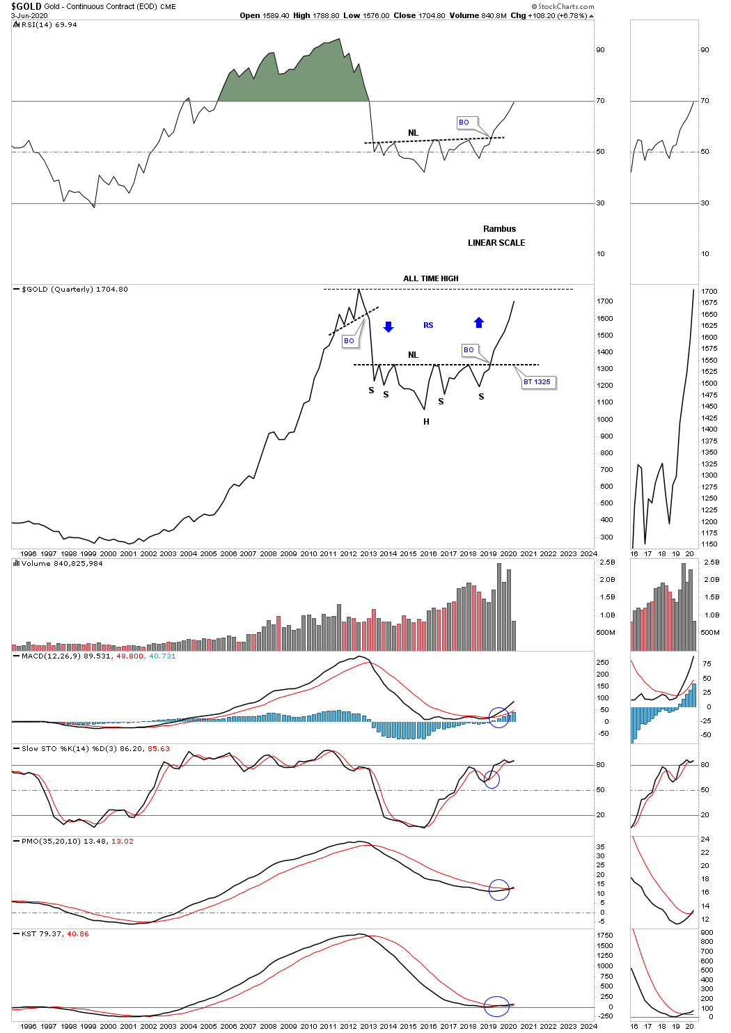
As we all know gold has been the leader during this second phase of the secular bull market. This quarterly line chart should give you a preview of coming attractions. Note how gold reversed symmetry over the same area on the way down as shown by the blue arrows.
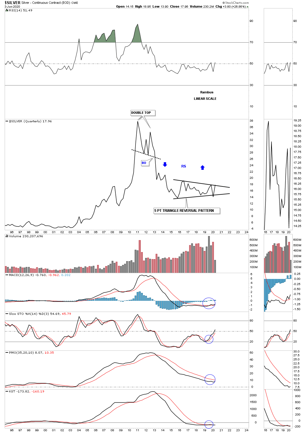
Silver is set up a bit differently than the other areas in the PM complex. As we know silver has been the lagging component within the PM complex. The price action is currently testing the top rail of its 5 point 2016 triangle reversal pattern. A breakout above the top rail will confirm it has joined the second half of the secular bull market in the PM complex.
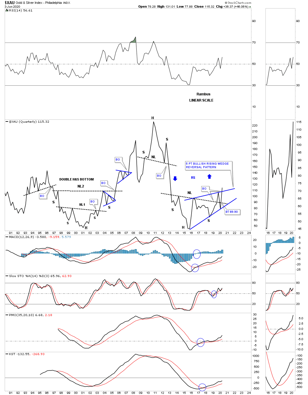
You may have noticed that some of the 2016 H&S bottoms could also be considered a 5 point bullish rising wedge reversal pattern. I have put both pattens on this quarterly line chart for the XAU so you can see both patterns.
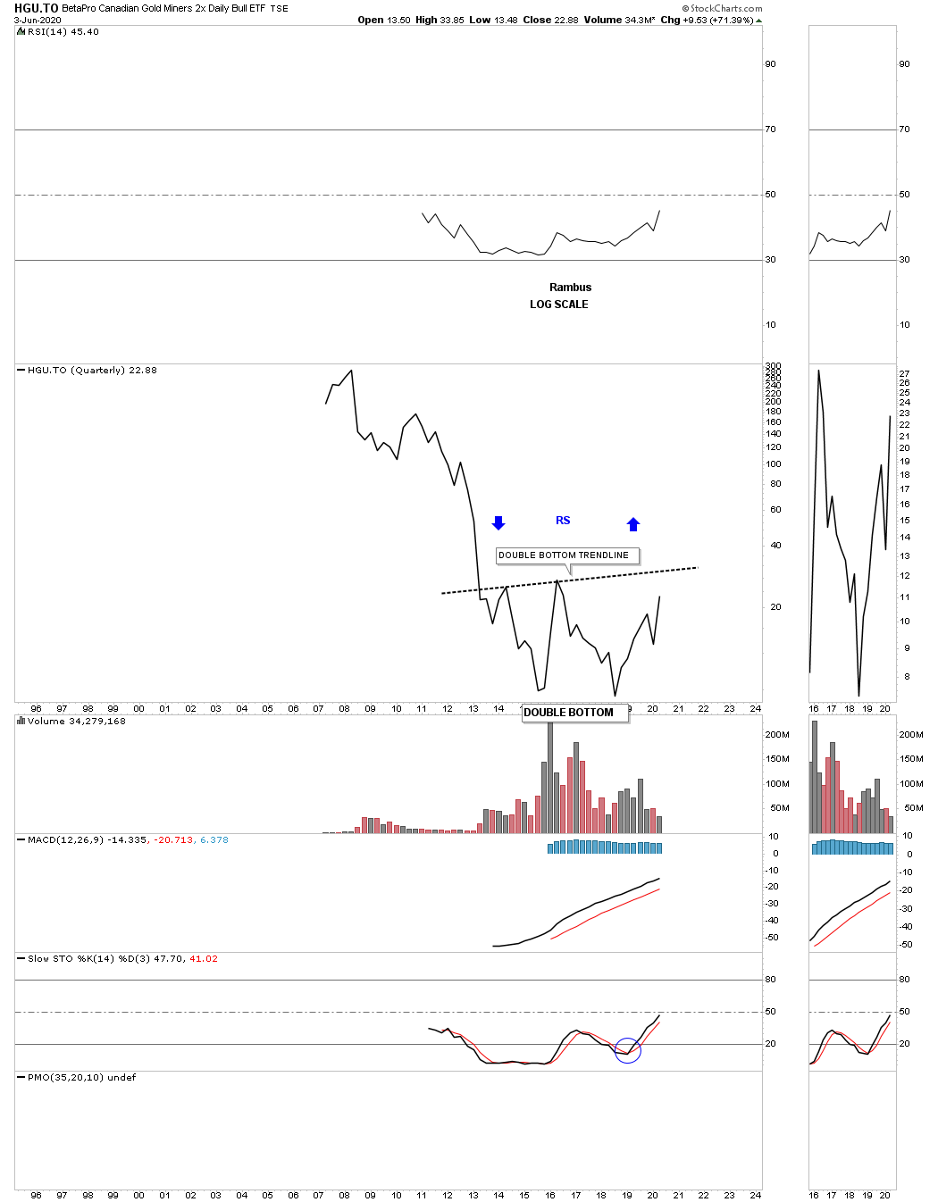
The HGU.TO doesn’t have a lot of history but it appears to be forming a large double bottom reversal pattern.
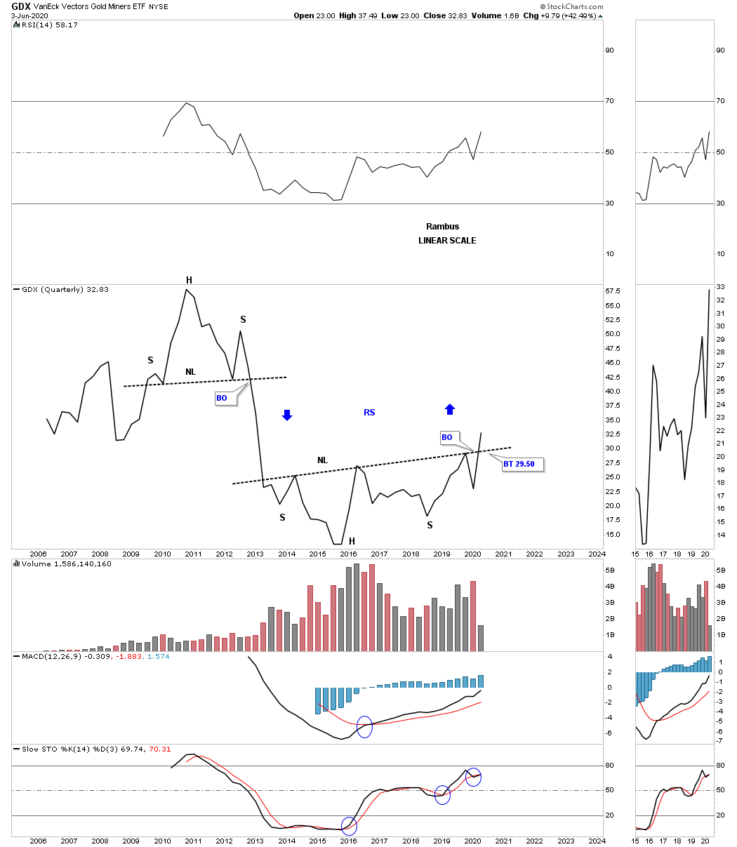
Next is the GDX which looks like many other big bases we’ve looked at tonight with the combo unbalanced H&S bottom with the 5 point bullish rising wedge reversal pattern. Also notice the possible reverse symmetry that lies just above.
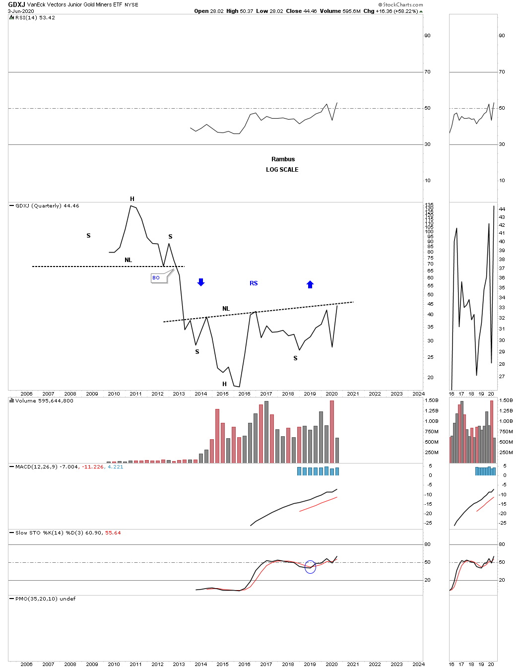
We also know that the GDXJ has been slightly weaker that most of the other PM stock indexes but its now getting close to testing its multi year neckline.
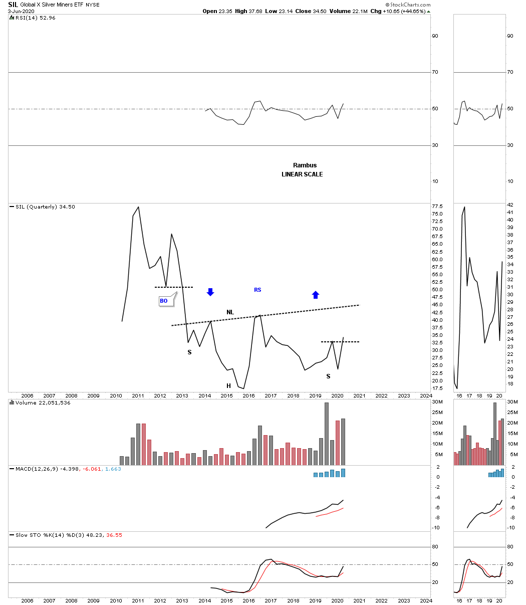
The other weakest component within the PM complex is SIL. If it can close out the month of June right where it is currently trading it will have put in a higher high and higher low which is the first sign of an uptrend.
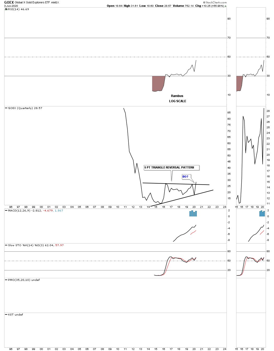
The GOEX is another area within the PM complex which doesn’t have a lot of history but it does have enough to show a 5 point triangle reversal pattern that is beginning to breakout.
There is no such thing as a guarantee when it comes to the stock markets but the closest thing I can say is that I will get the big picture and trend right which is the most important part of trading. Getting the big trend right is half the battle.
Part 1 Commodities
With the unprecedented amount stimulus going into the economy many investors are wondering if it will bring on inflation. So far all the stimulus from the 2008 crash to the present hasn’t had much of an impact on the inflation rates as most commodities have been moving lower. With that said there will eventually comes a time when things revert back to the means when a stock or index gets overextended in one direction or the other.
Commodities in general have been in a bear market since the high in 2008 with several consolidation patterns that formed along the way which kept the bear market intact. The US dollar has also played a big role in the bear market which is generally the case. How the US dollar goes generally so goes commodities.
Lets start with the weekly chart for the US dollar we looked at last week in the Wednesday report which shows a possible horizontal trading range building out. The price action has completed 2 compete reversal points with the 3rd one now in progress. There are several different possible scenarios that could play out that we have to be aware of.
The first scenario could be that if the US dollar fails to make it all the way down to reversal point #4 and puts in a higher low we could see a triangle forming. If the US dollar does in fact decline to the bottom rail at reversal point #4 we could then see a possible rectangle building out if the bottom rails holds support. A possible 3rd scenario would be if the bottom rails at reversal point #4 fails to hold support and the US dollar breaks through to the downside we could see a rather large double top reversal pattern. For now these possible scenarios are just something for us to watch for.
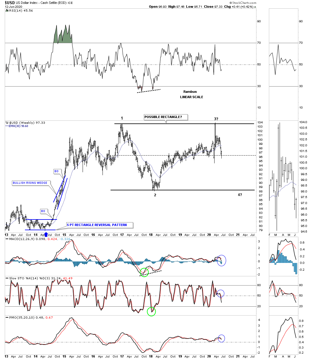
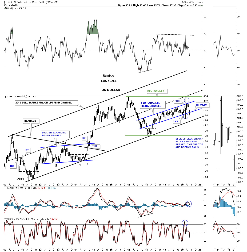
Lets step back a little further in time and look at a 12 year weekly chart for the US dollar which shows a brown shaded support and resistance zone. From the middle of 2010 to the middle of 2014 the US dollar built a symmetrical triangle as its consolation pattern which launched the infamous dollar rally that crashed the commodities complex during the middle of 2014 to the March of 2015. After that impulse move ended in March of 2015 it looked like the US dollar was going to consolidate that move by forming a rectangle consolation pattern. As you can see there was a brief breakout above the top rail which failed miserably after forming that small H&S top. That small H&S top led to a very large decline which found support on top of the brown shaded S&R zone which is where you would expect to see at least initial for support.
If you recall we were watching that rising channel between reversal points #2 and #3 for the biggest part of its development as a combo chart with the HUI on the bottom. That was a long drawn out affair where the rising channel kept going higher and higher with a little minor false breakout of the top and bottom rails but nothing to really change the uptrend channel. Then we finally got that massive breakout to the upside but there wan’t enough energy to take out the previous high which set up the beginning of our current trading range. You can see last weeks bar closed below the bottom rail of the rising channel. If the backtest can hold resistance then the odds go up dramatically that we’ll most likely see a move back down to the brown shaded S&R zone to complete the 3rd reversal point. For what its worth that brown shaded S&R zone is classic with one consolidation pattern below and the upper one finding support on top of the lower one.

Lets start putting some of the pieces of the puzzle together and see what we come up with. The 2 patterns on the chart above, the triangle and possible rectangle, are forming an uptrend channel. On this chart I made the rectangle green so you can see it better. Now it becomes a waiting game to see how the US dollar interacts with the bottom rail of the blue rising channel. Will the backtest hold? If it does then the bottom rail of 2010 bull market uptrend channel will come into play. Then if the bottom rail of the uptrend channel fails to hold support, which looks very strong with all the touches on it, fails to hold support then the bottom rail of the possible green rectangle will come into play.
This next chart is a weekly combo chart which has the US dollar on top and gold on the bottom. When looking at charts like this searching for the inverse correlation it is never perfect. There will be times when it’s not very tight at all and then there are time when they are very inversely correlated. It always best to look at the big picture to see the general trend for each. Overall you can see the inverse correlation these two had from 2011 when gold topped out and the US dollar bottomed out.
That inverse correlation came to an end in January of 2019 when gold on the bottom broke out above the top rail of its 2011 bear market downtrend channel while the US dollar just kept plugging along in its uptrend channel. The next test came for gold came when it had to negotiate the top rail of its 2016 triangle which is the same one we’ve been following on the other PM stock indexes. So while gold enjoyed two very important breakouts to get its bull market going, red circle, the US dollar didn’t do much of anything. If we begin to see a strong inverse correlation again that will most likely show the US dollar breaking down from its bull market uptrend channel while gold moves inversely higher. That would be the ideal scenario for PM investors.

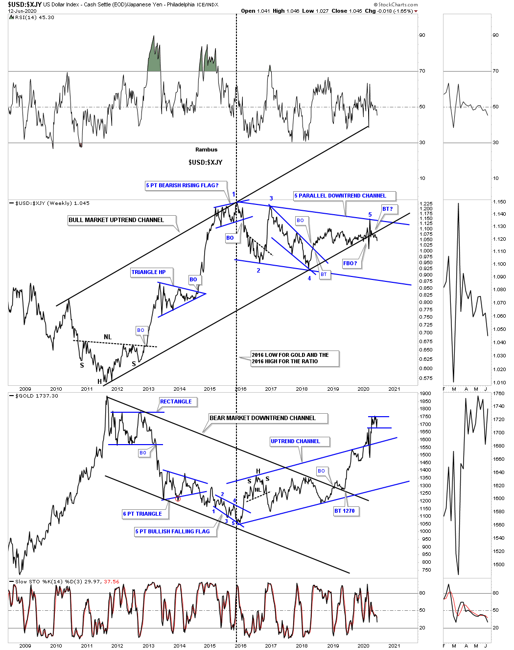
This next chart is a ratio combo chart which has the US dollar to the XJY Japanese yen ratio on top with gold on the bottom. There has always been this nagging inverse correlation between the ratio and gold. When the ratio is rising, meaning the US dollar is outperforming the XJY, gold generally declines and vise versa. As you can see the ratio chart on top and gold on the bottom both put in a strong reversal in January of 2016 which began the downtrend channel for the ratio and the uptrend channel for gold. While gold has already broken out of its 2011 bear market downtrend channel and its 2016 uptrend channel the ratio is just now starting to breakout below the bottom rail of its 2011 uptrend channel. You may have noticed that the ratio chart on top is now beginning its 5th reversal point to the downside which would be very beneficial for the PM complex if it continues to decline all the way to the bottom rail.
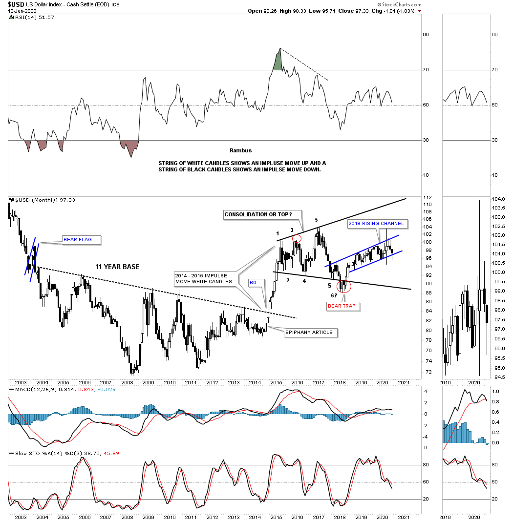
This last chart for the US dollar is the old epiphany chart where I recognized the massive 11 year base before the breakout which is often the case with really big patterns. The breakout above the top rail of the 11 year base produced a classic impulse move by forming a string of white candlesticks all in a row. It was this chart that gave us a big heads up that something bad was going to happen to commodities and it did. Here again you can see how the 2018 uptrend channel that we looked at earlier fits into the big picture within the expanding triangle. If that bottom rail fails to hold support there isn’t much in the way of support until the bottom rail of the 2015 expanding triangle is reached which would give commodities and the PM complex a nice tailwind.
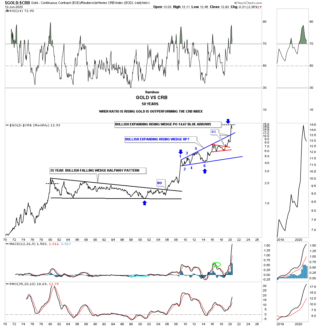
To find out how gold and commodities have performed against each other below is a ratio chart which compares these two. When the ratio is rising gold is outperforming the CRB index and vise versa. For 25 years between 1980 and 2005 both the CRB and gold canceled each other out with neither gaining the upper hand. All that came to an abrupt halt in 2005 when the ratio exploded to the upside meaning gold was kicking the CRB indexes butt. That went on for over 3 years before gold needed a rest to consolidate its gains which it did by forming an 11 year bullish expanding rising wedge. The blue arrows show that the price objective for that bullish expanding rising wedge halfway pattern was just reached at 14.67. This ratio chart reminds me a lot of the gold:silver ratio chart where the ratio went into the stratosphere where there was very little oxygen to keep the ratio alive.
We know that commodities as measured by the CRB index have been in a bear market since its bull market high in 2008. There are some signs that commodities may have finally bottomed out and are ready to begin a multi year bull market. The US dollar will be key for this to happen which is why I spent so much time on it tonight. In part 2 we’ll look at all the individual commodities to see if those charts agree that inflation is in our future.
Part 2 Commodities
In part 1 of this in-depth report on commodities we analyzed the US dollar looking for clues to help give us some insight on what may lie ahead on the inflation front. Inflation as we know it has been pretty muted for a very long time. We’ve had some small bouts of it from time to time but nothing to get excited about. The last really serious bout of inflation that I remember was back in the 1970’s toward the end of the last secular bear market. That was also the time in 1980 that gold topped out at 870 and silver at 50 and interest rates were close to 20%. From that point on deflation has had the upper hand in general.
Normally during the end of a big move in a stock for instance, there will be a capitulation move where the price action can go parabolic that ends the move which can be on a short term scale or a very long term scale which is relative to the time scale you are looking at. These types of move can signal a new bull or bear market as well. Again, it all depends on what time scale you are looking at.
Tonight we’ll look at some long term commodity charts to see if they can give us any information regarding the inflation or deflation debate that seems to be on a lot of investors minds right now especially with all the stimulus being pumped into the economy. Being able to spot a major trend change early on can help us get on the right side and hopefully take full advantage of what of the situation presents to us.
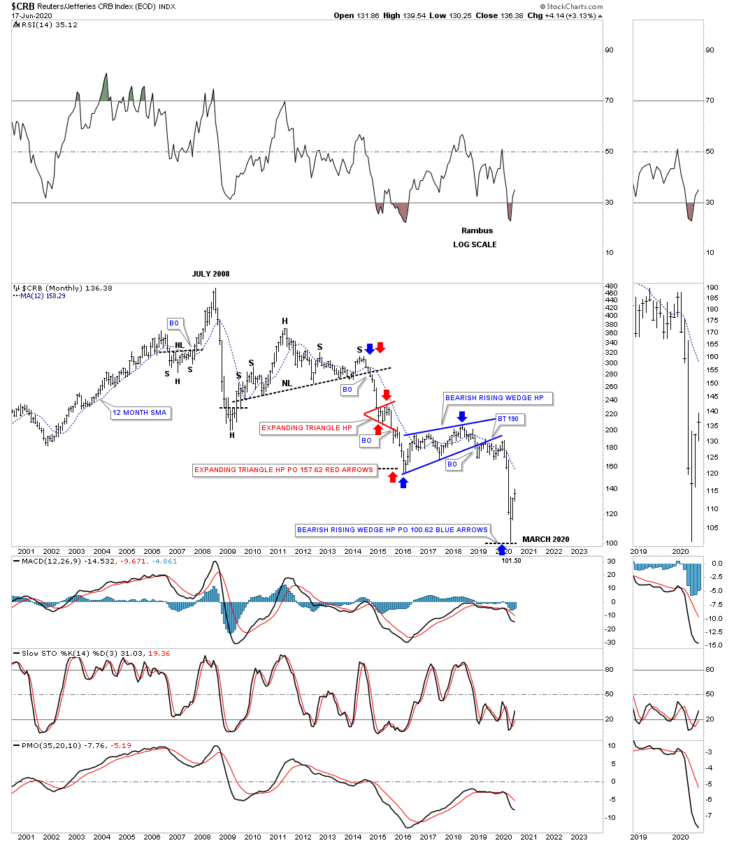
I have a ton of charts to show you tonight so lets get right to it keeping in mind what we discussed above about a possible capitulation move. Instead of starting out with the short term charts and working our way out to the longer charts I’m going to start with the quarterly chart for the CRB index first. Keep in mind most of the long term quarterly charts you will see tonight were originally built in 2014 in anticipation of that particular deflationary event.
What led us to believe that some type of deflationary event might come our way is when that 5 year H&S top completed in October of 2014. At the time of that impulse move down we were looking for the upper brown shaded S&R zone to hold support which it did after a strong test. As you can see the price action then backtested the S&R zone from below and formed the blue bearish rising wedge halfway pattern to the downside. This is the exact same original chart I built back then where I also showed how the CRB index could reverse symmetry to the downside over the same area on the upside in the 1970’s. I was probably the only person on the planet that thought the CRB index could fall that low and the way it got to that low. Only possible through Chartology.
The blue bearish rising wedge had a price objective down to the 102 area based on the breakout to breakout method. The breakout to breakout method measures from the breakout of the H&S neckline to the first reversal point in the blue bearish rising wedge, black arrow. You take that distance and add it to the breakout point on the bearish rising wedge to get your price objective at 102. If a stock or in this case the CRB index ever had a look of capitulation this 75 year quarterly chart definitely does.

This next chart for the CRB index is a 20 year monthly look which shows its bear market in more detail that has lasted almost 12 years. At a very minimum we should expect to see at least a cyclical bull market if the secular bear market isn’t finished yet. My best guess right now is that the bear market has completed and a brand new bull market is just getting underway that could last for many years to come with our recent capitulation low never to be seen again.
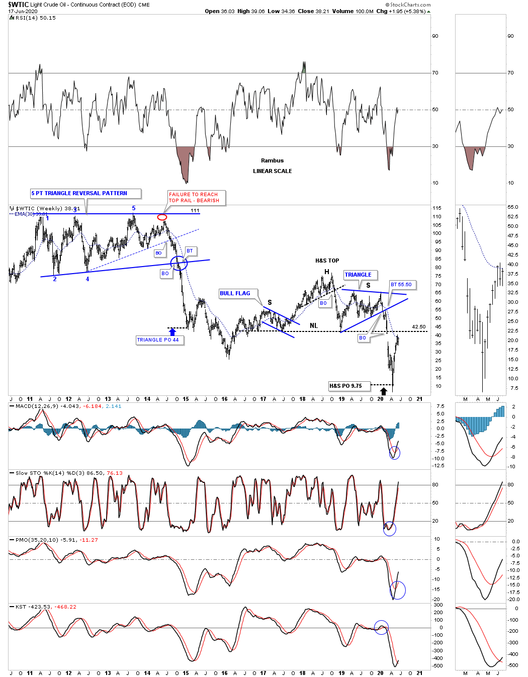
Next is the long term quarterly chart for WTIC that goes all the way back to its inception in the early 1980’s. Just like the CRB index the WTIC also built out a large H&S top which led to its crash in the middle of 2014 to March of 2015. Also like the CRB index we were looking for initial support to come into play at the brown shaded S&R zone which happened. The WTIC also built out the blue bearish rising wedge which then morphed into a classic H&S top with the left shoulder and head forming inside of the rising wedge while the right shoulder high formed on the backtest to the bottom rail of the blue rising wedge.
Note the blue bullish rising wedge that formed in the early 2000’s which gave oil the energy it needed to take out that 20 year brown shaded S&R zone. Also the width of that massive double bottom had a price objective up to the 146 area which ended that parabolic rise which also ended the bull market that began in 1998. I can honestly say that I have never seen a quarterly bar like this quarterly bar on any chart I’ve ever built. I will be very curious to see what this chart will look like in the next 2 to 5 years.
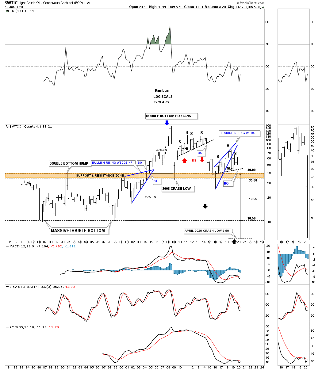
Below is a 10 year weekly chart for WTIC which shows the price objective for the H&S top that formed on top of the brown shaded S&R zone.
Next is a 45 year quarterly chart for Copper which has held up better than the CRB and WTIC through the years. Just like the CRB and WTIC which built a massive base so to did Copper. The base Copper built began forming in the late 1970’s and finished in 2005 which formed a massive flat top expanding triangle. Copper also formed the blue bullish rising wedge just below the top rail of its massive flat top expanding triangle which gave it the energy it needed to breakout above resistance and rally up to its price objective at 3.81.
Moving over to the right hand side of the chart Copper could very well be building a possible blue bullish expanding falling wedge which won’t be complete until the top rail gives way. Copper could also be building a double bottom as well. Also unlike the 2008 crash which backtested the top rail of that massive flat top expanding triangle this latest decline has held up very well failing to make a lower low on this time scale.
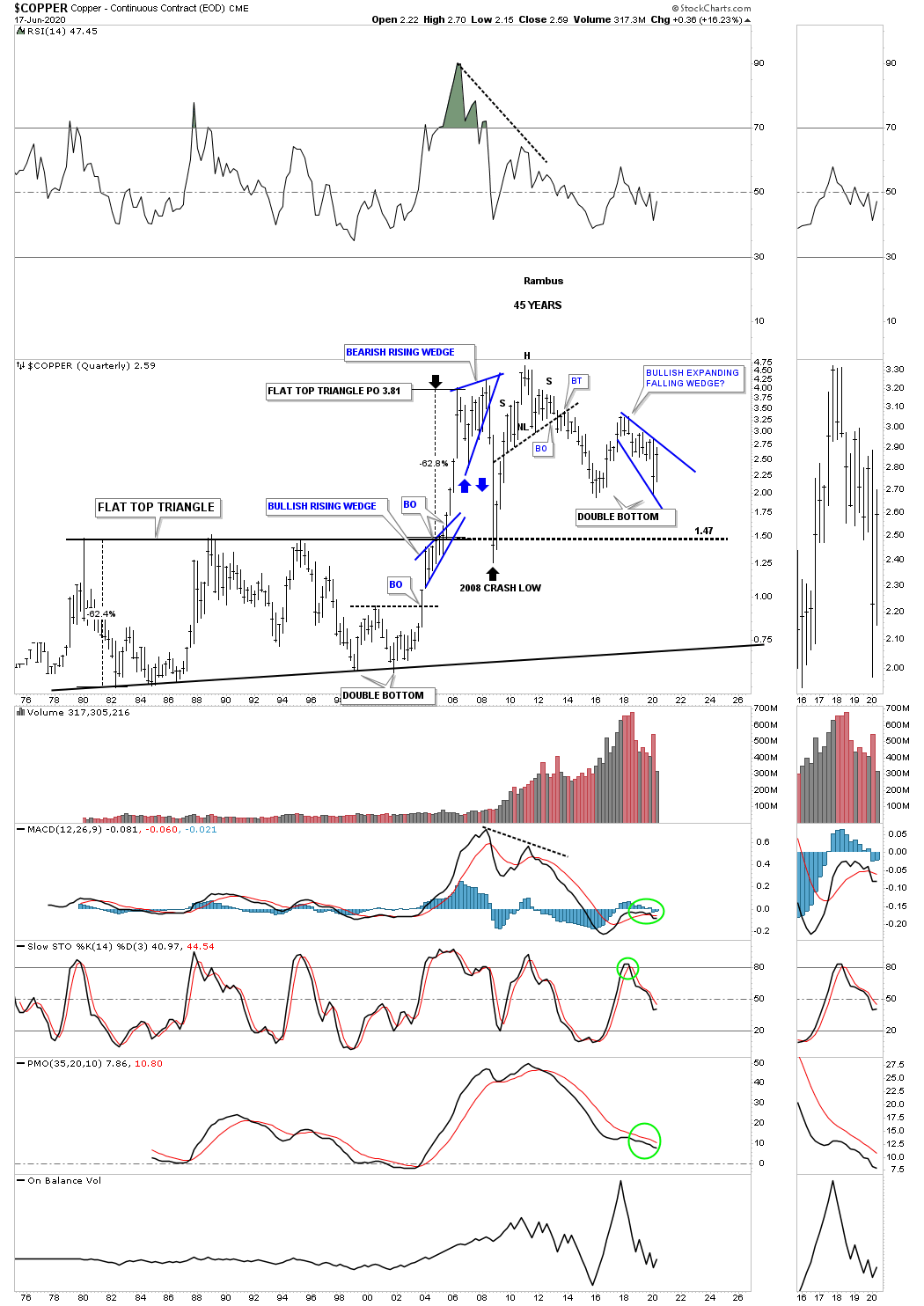
This next chart for Copper is a 25 year monthly chart which gives us another important perspective. Since the 2011 high Copper may very well be building a very large triangle consolidation pattern. The first thing we’ll want to see is for the price action to breakout above the top rail of the small blue expanding falling wedge. If that occurs then the top rail of the 2011 triangle will offer initial resistance which would most likely set up a ping pong move between the two trendlines.
Note the large double bottom which launched Copper on its bull market in 2000 that ended at the 2011 high. If you were to overlay one of the PM stock indexes, say the HUI on top of this Copper chart, these two would match up fairly closely as far as the major turning points are concerned.
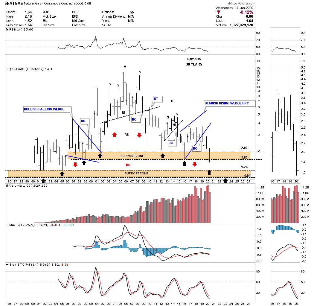
The last very long term quarterly chart I built back in 2014 was the NATGAS chart. You can see it has all the similar characteristics that the quarterly charts above are showing. If you stand back a bit and look at this chart from a distance the reverse symmetry on each side of the head is striking IMHO. Just like the other commodities we looked at tonight NATGAS also found initial support on the upper brown shaded S&R zone. We now have 3 separate hits on the brown shaded S&R zone with the last one occurring today. You would have to go all the way back 25 years to 1995 to see today’s low. I thought I might see a bounce off of the bottom of the brown shaded S&R zone when I took that speculative trade on UGAZ a week or so ago. Now I wouldn’t be surprised if we see the lower brown shaded S&R zone hit. I would think if that were to happen it would represent a very good buying opportunity for the long term especially if commodities in general are beginning a new bull market.
Part 2 is taking much longer than I originally thought it would take as I have many more commodity charts to show you. I’m going to leave it here for tonight and I will do part 3 this weekend.
Part 3 Commodities
In part 3 of this in-depth report on commodities we’ll look at many individual areas to see what their long term charts look like. In order to find long term truning points, bottoms in a bear market or tops in a bull market, the only way that is possible is to look at the big picture. Keep in mind when looking at these long term charts that the process of reversing from a bear market in commodities to a bull market is going to be gradual in the beginning. It will be debated for several years before the realization that inflation is actually taking hold and there will be no more denying the fact. The next debate will be, how high will the inflation rate go? I think the Chartology will keep us one step ahead of the crowd.
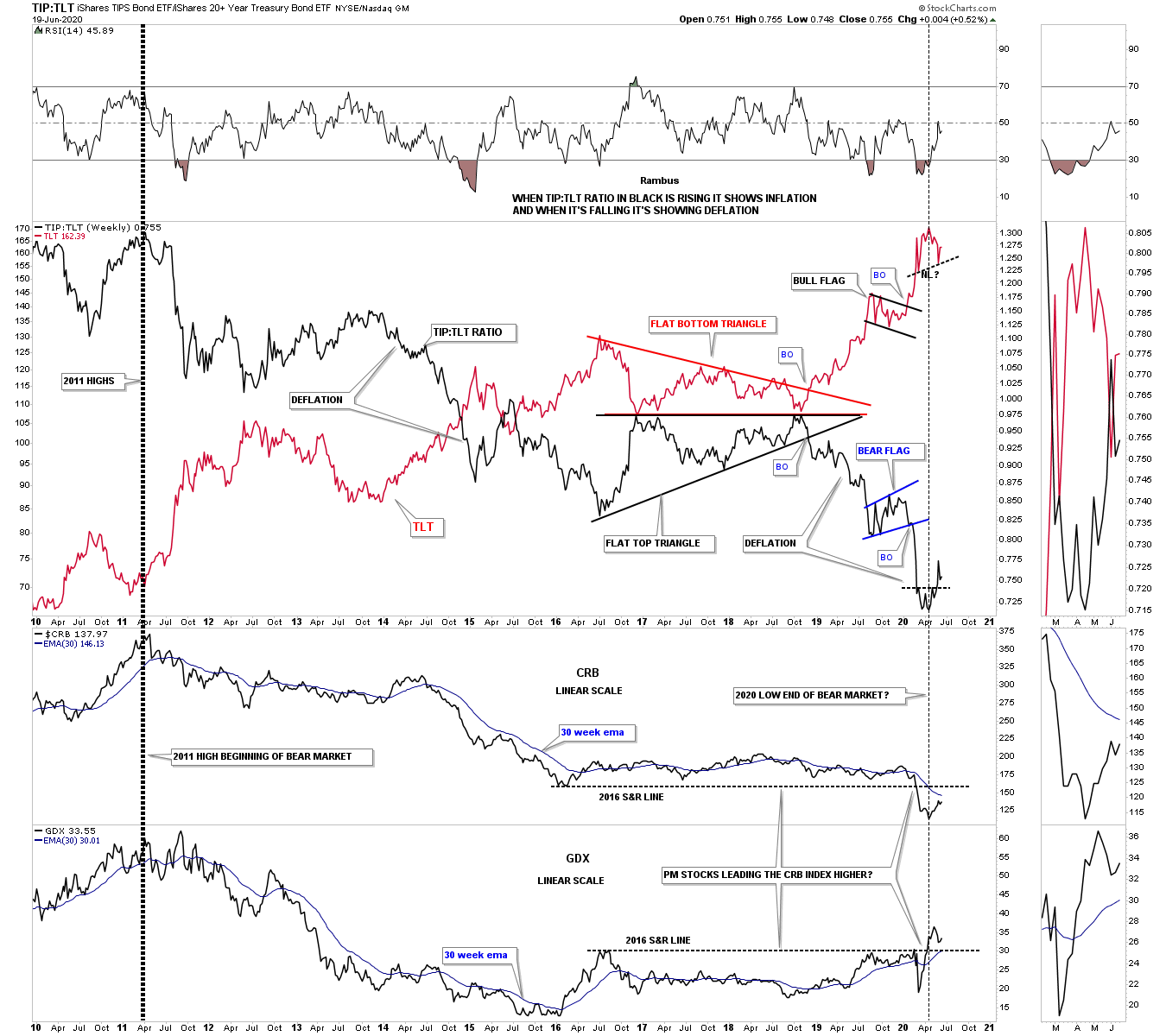
Most investors have their own way to determine whether we are in an inflationary or deflationary environment. For me personally I like to use a ratio combo chart which has the TIP:TLT ratio in black on top overlaid on the TLT in red with the CRB and the GDX below. Below is a long term weekly chart that goes back to the 2011 high when many commodities and the PM complex topped out. As you can see the ratio in black has been in a steady decline for close to 10 years now along with the CRB and the GDX.
Why do I think we are at the very beginning of a possible inflationary environment? The first little clue will be if we see the possible small red H&S top complete and breakdown on the TLT which would coincide with the small reversal pattern on the black ratio to begin a strong rally to the upside. Now look to the bottom of this combo chart where the CRB and GDX are located. Note how the CRB, TLT and the TIP:TLT began reversing 2 months ago in April, black dashed vertical line.
It is generally understood that the precious metals complex usually leads the rest of the commodities higher at important bottoms. Now lets look at the GDX on the very bottom where you can see this happening in real time as it has already broken out above its 2016 overheard horizontal resistance line while the CRB index is still trading below its 2016 resistance line and it 30 week ema. So if the PM complex is leading commodities higher then they should follow the PM complex higher which should eventually lead to some degree of inflation down the road.
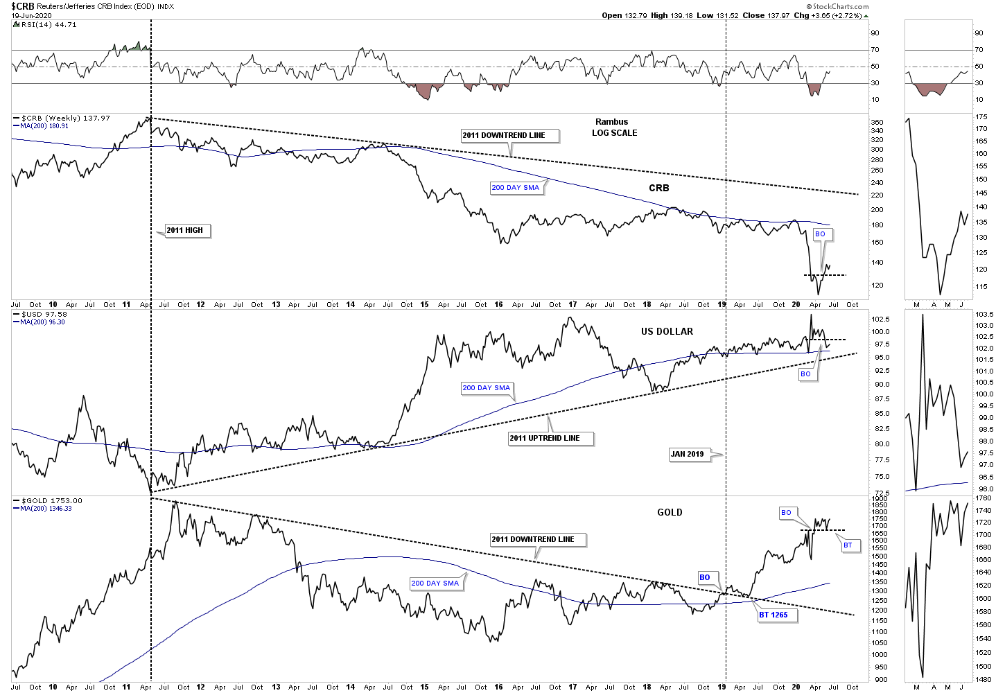
Lets look at another combo chart which has the CRB on top with the US dollar in the middle and gold on the bottom. Again if the PM complex leads commodities at important turning points then this combo chart paints a very clear picture of this happening. You can see the black dashed trendlines which governed the major trend since 2011. The inverse correlation was pretty strong until January of 2019 when gold broke out above its 2011 downtrend line while the CRB has kept its inverse correlation with the US dollar that is still taking place to this day.
On the very far right hand side of the chart you can see a small horizontal black dashed line which shows the CRB and gold breaking out above their S&R line while the US dollar has broken below its small S&R line. This a very powerful looking chart for commodities and the PM complex especially if we see the uptrend line on the US dollar give way to the downside.
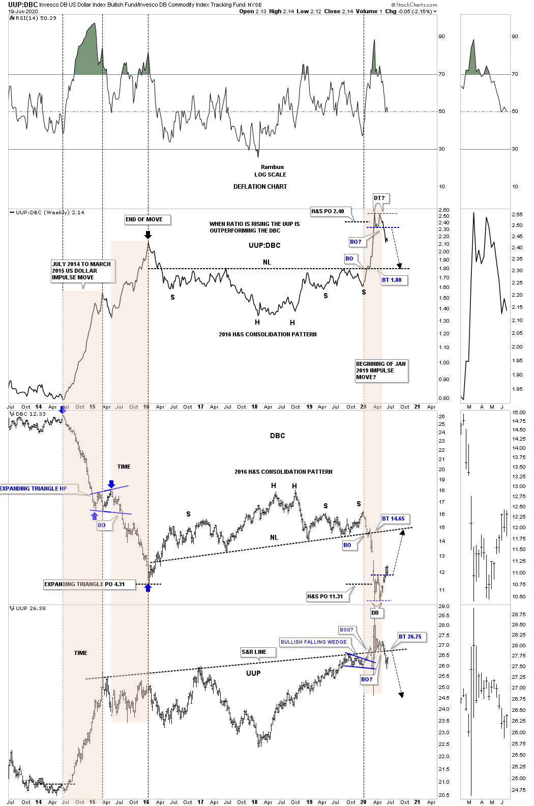
This last ratio combo chart we’ll look at has the UUP:DBC ratio on top with the DBC commodity index in the middle and the UUP on the bottom. When the ratio chart on top is rising that means the UUP is outperforming commodities and just the opposite when it is declining. On the left side of the chart, the 2 brown shaded areas show that massive decline in the DBC during the 2014 – 2015 collapse in commodities. Each brown shaded area shows the 2 impulse legs down separated by the expanding triangle halfway pattern. The blue arrows measures the blue expanding triangle price objective down to the 4.31 area. The brown shaded areas measures time which you can see each impulse leg down were almost exactly the same in price and time which is classic Chartology.
We’ve been following that small double top on the ratio chart and double bottom on the DBC chart on a different combo chart which has all the different commodity indexes on it. This combo chart has the UUP on the bottom instead. The last time we looked at this combo chart the UUP was sitting right on top of its 2015 S&R line. Four weeks ago the price action broke below the 2015 S&R line about the same time the DBC broke above its small double bottom black dashed line. We have a very big test coming up on the UUP chart. Is the 2015 S&R line going to hold resistance if we see a complete backtest which looks underway? To say this is a very critical inflection point is an understatement as the consequence for the long term couldn’t be more important.
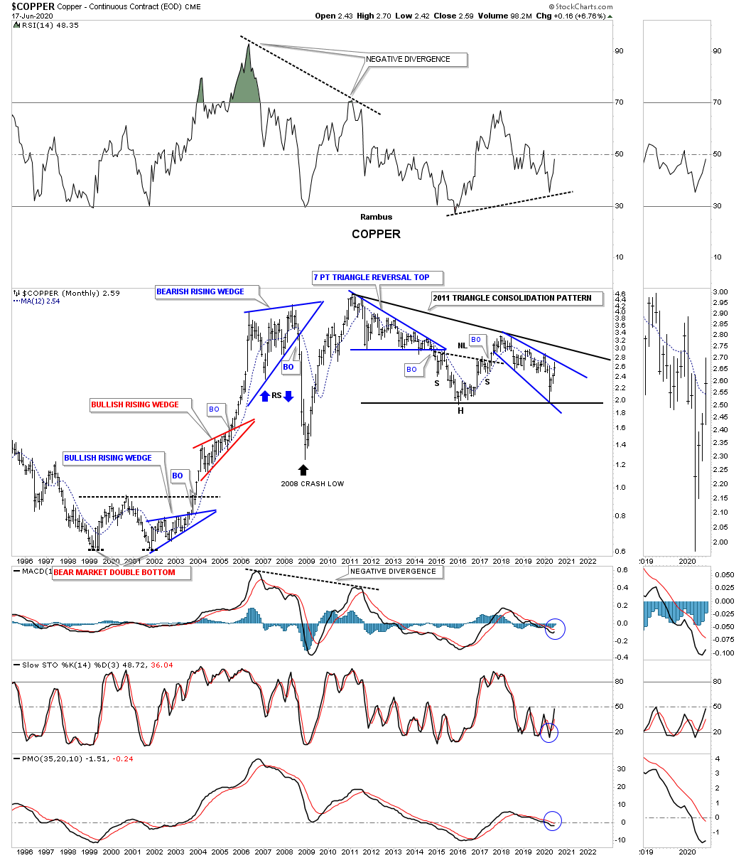
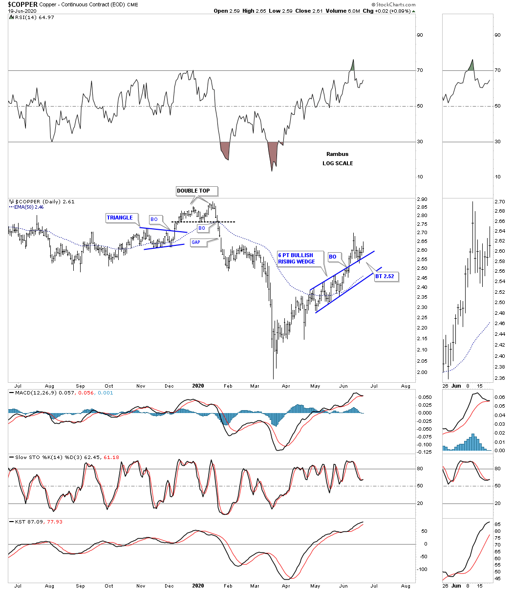
Now lets look at some individual commodities to see what they may be suggesting as far as an important turning point. Lets start with a daily chart for Copper which shows it trading in a possible bullish rising wedge which has had a breakout and is currently in backtest mode.
This long term monthly chart for the COPX, Copper miners etf, is forming a possible bullish expanding falling wedge which could be part of a possible double bottom going back to the low in 2016.

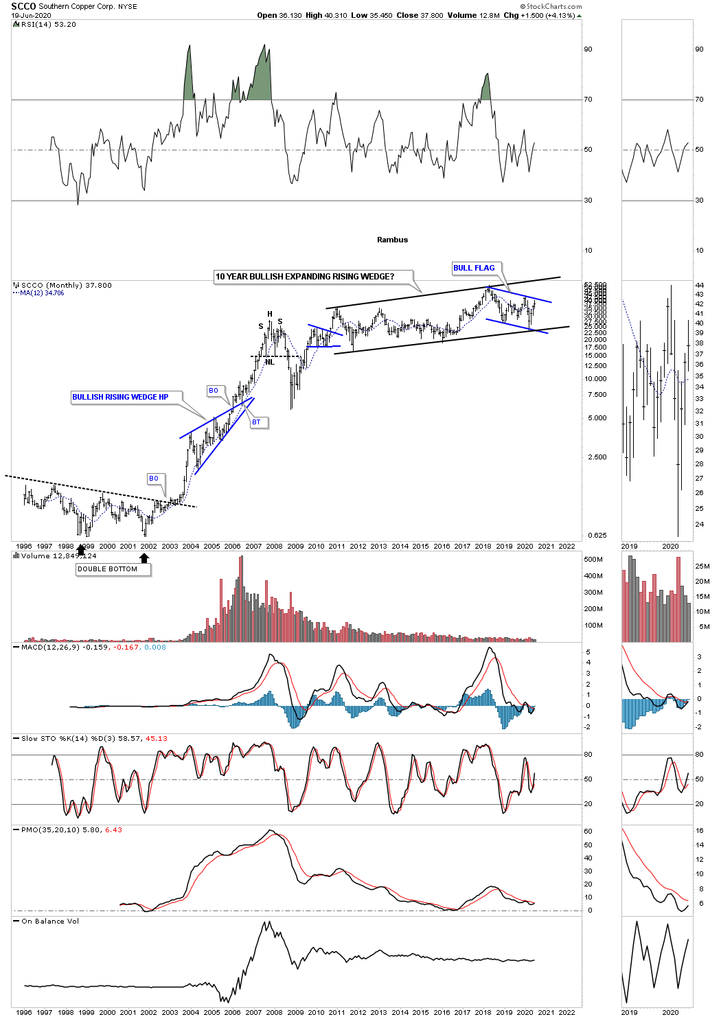
SCCO, Southern Copper, has been building out a 10 year expanding rising wedge. A breakout of the blue flag will ensure a move to the top black rail which could then lead to a major breakout and much higher prices.
Lets look at a few steel stocks as they have been consolidating for a long time. First is NUE which just finished putting in its 3rd reversal point after breaking down from the H&S top and reaching its measured move at 31.40.

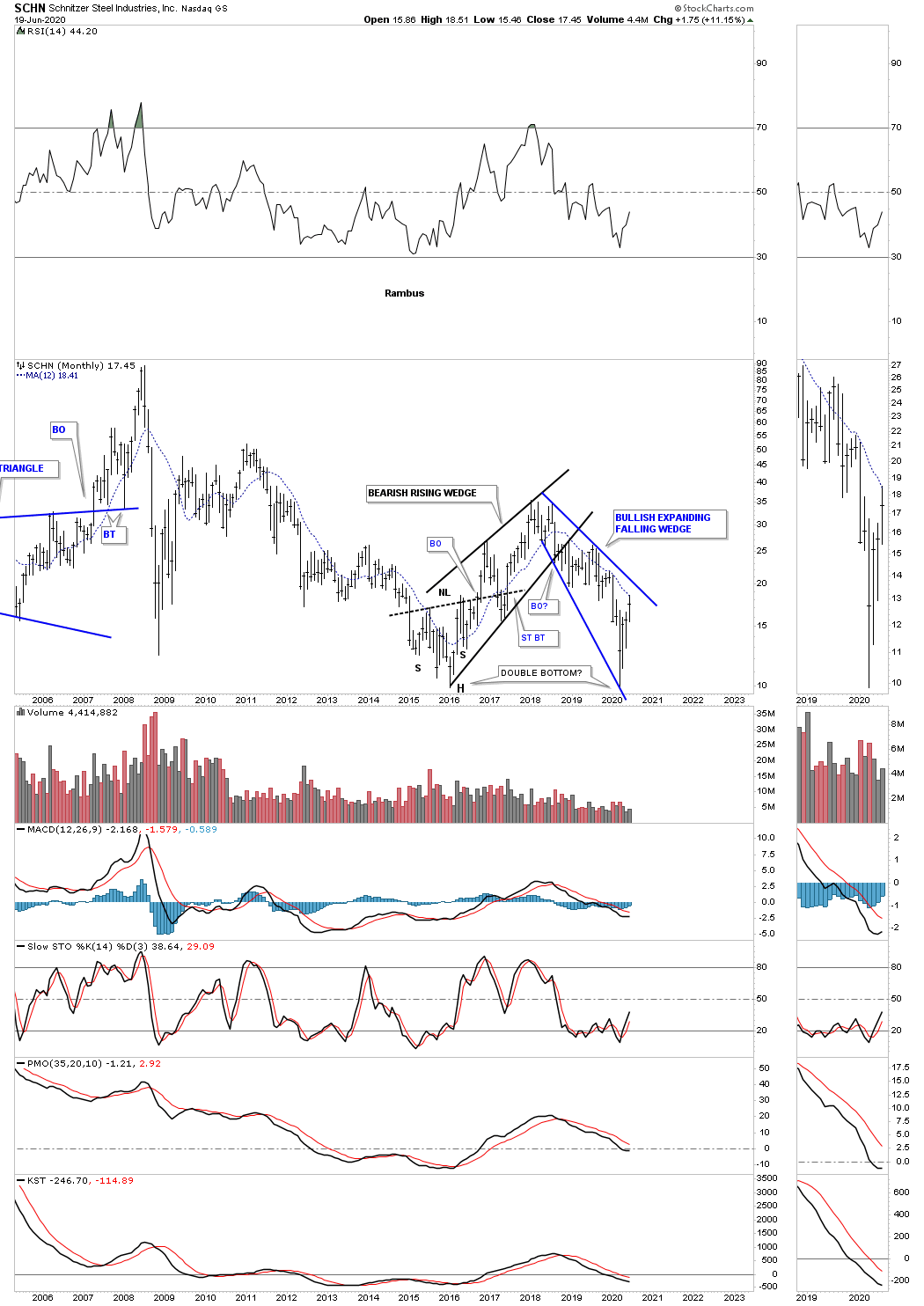
SCHN is another steel stock that is forming a possible bullish expanding falling wedge as the right bottom of a possible double bottom reversal pattern.
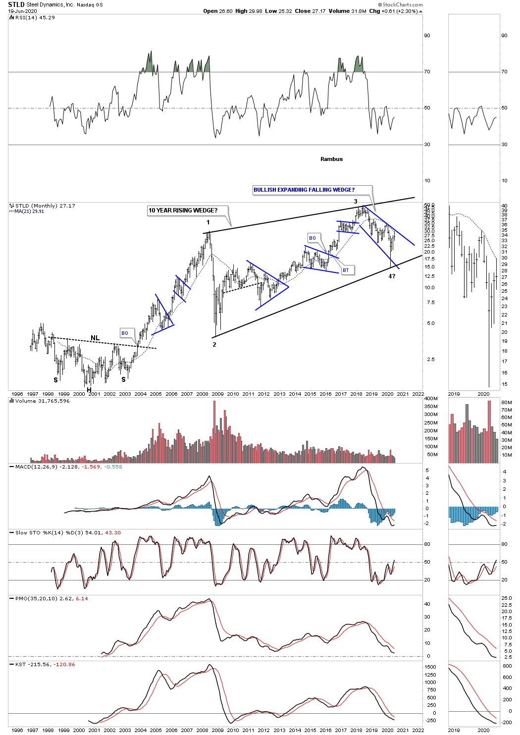
STLD is building out a potential very large bullish rising wedge that is 10 years in the making. The blue consolidation patterns show the internal structure of the 10 year rising wedge with the 3rd reversal point completing during the crash low in March of this year. A breakout of the top rail of the blue expanding falling wedge will be a very bullish development as it will suggest a move to the top rail of the black rising wedge and will complete the all important 4th reversal point.
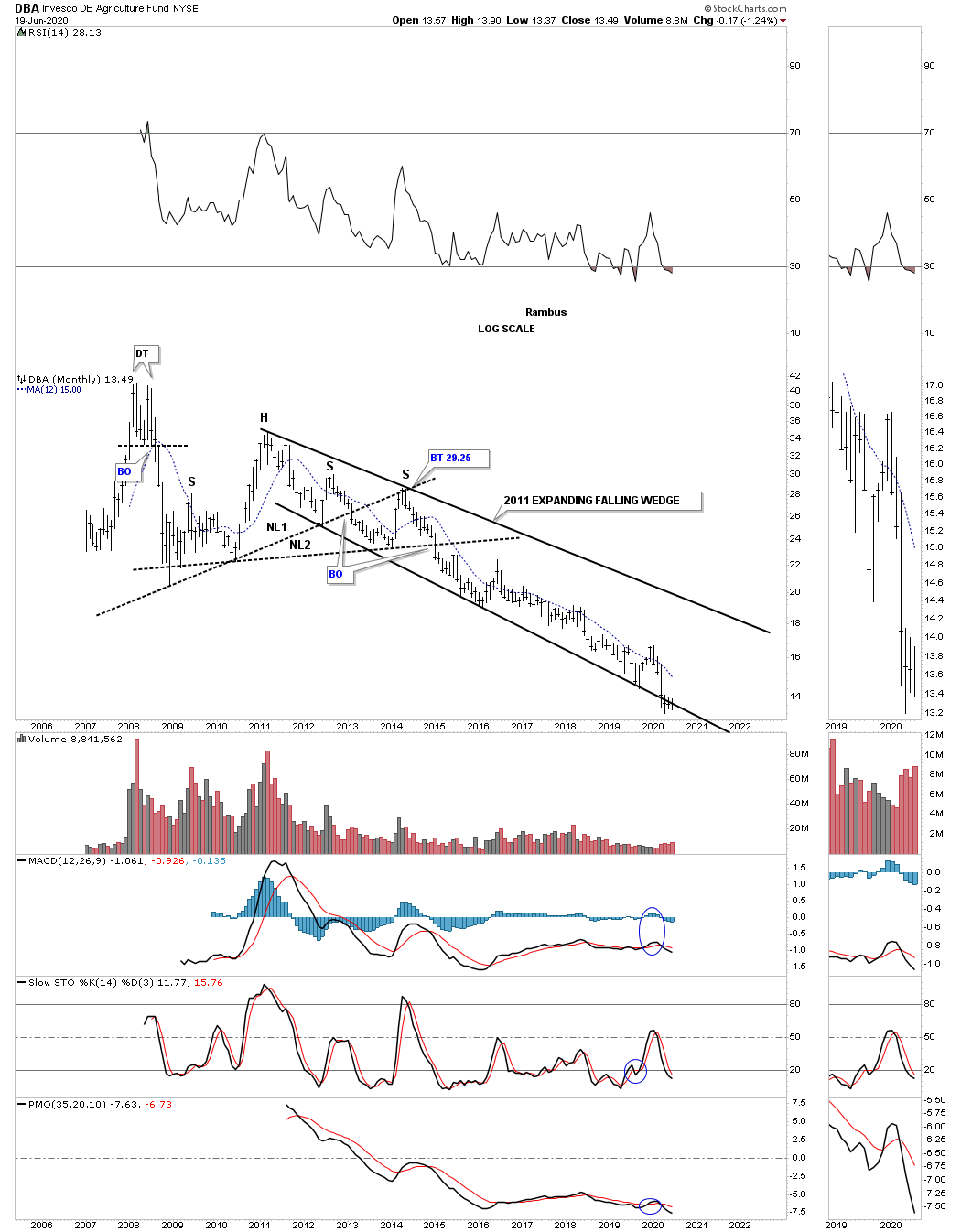
The DBA, agricultural fund, has been trending down since 2011 which puts it right up there with natural gas as the weakest areas in the commodities complex.
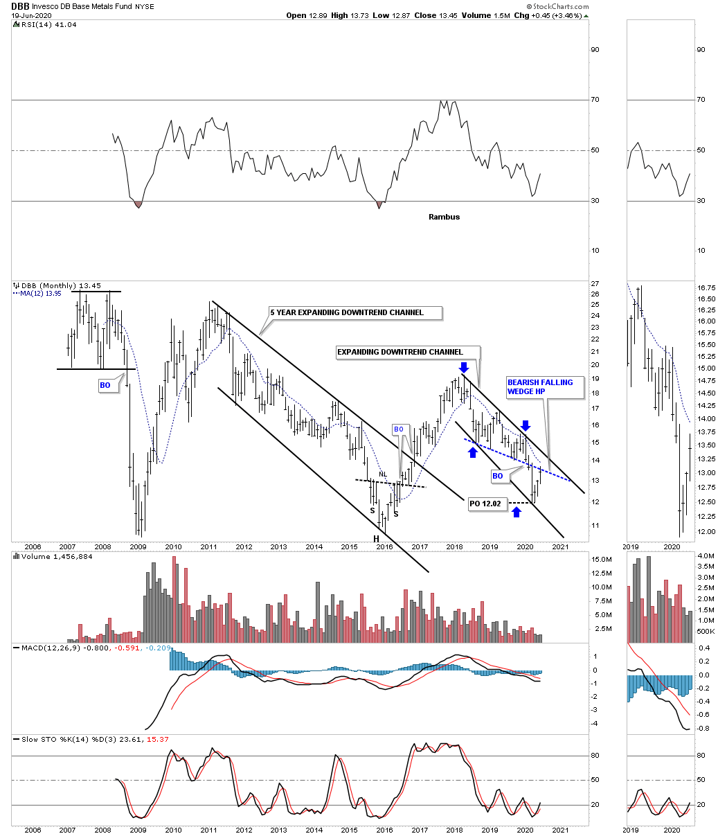
The DBB, base metals fund, has been trending lower since 2018 forming a possible bullish expanding falling wedge. The blue dashed line shows the bottom rail of what was a bearish falling wedge halfway pattern which reached its price objective at 12.02 as shown by the blue arrows.
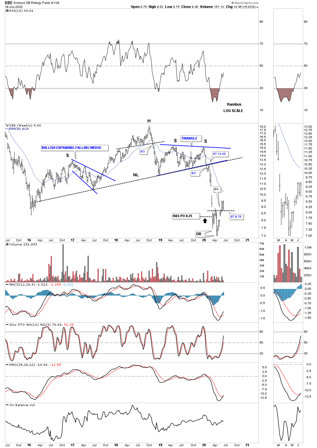
The DBE, energy fund, looks to be completing a small double bottom after reaching its H&S price objective at 8.25.
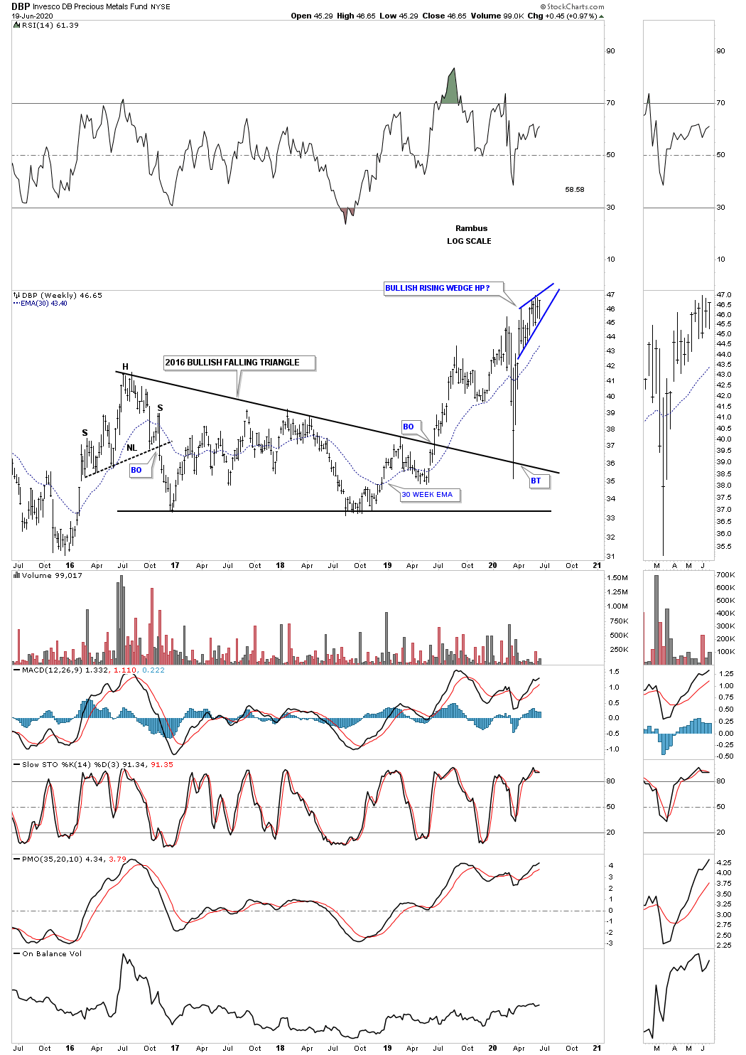
The DBP, precious metals fund, is forming a potential very explosive bullish rising wedge which is sitting on top of a vertical flag pole. This is about as bullish a setup that you will ever find.
PPLT, Platinum, is doing the same thing that SLV did. If you recall SLV had a massive false breakout below the bottom rail of its 2016 trading range which I described as a bear trap after the price action rallied back into the pattern. PPLT appears to have done the exact same thing.

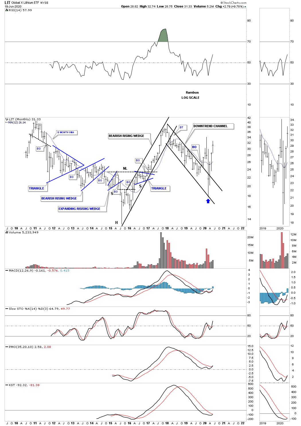
LIT, Lithium etf, has been in a strong rally after the crash low in March of this year. It is really not that far off from making a new all time high.
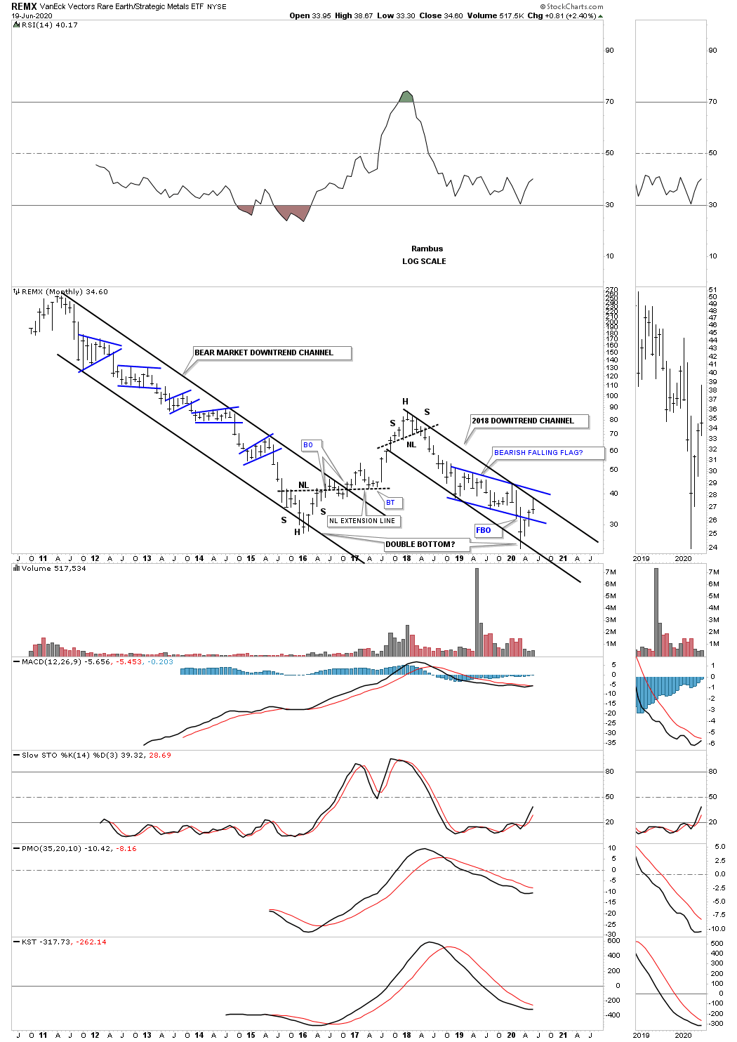
REMX, rare earth etf, has been a dog for most of its existence with only one countertrend rally. It could possibly be putting in a double bottom reversal pattern. Note how the price action hit the top rail of the 2018 downtrend channel this month and is backing off. This tells us the top rail is still hot and to be respected. This makes a breakout above the top rail much more important when it happens.
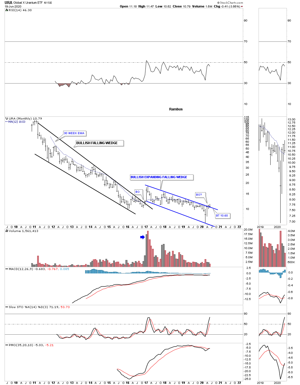
URA, Uranium etf, had been very weak for most of its existence but could be showing a little life if it can hold the potential breakout above the expanding falling wedge on the backtest that is currently underway.
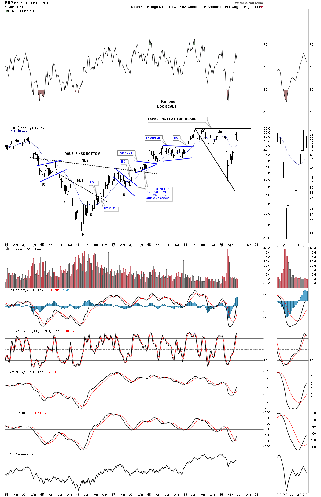
BHP is one of the biggest miners in the world and had been doing pretty good until the March crash. It has since recovered most of its losses and is forming a possible flat top expanding triangle.
RIO is another very large mining company which formed a massive 10 year triangle with the breakout taking place in December of 216 and has been in a bull market ever since. It found support for the 2nd time on the backtest to the neckline symmetry line taken from the 2016 H&S bottom. You can see the price action hit the top rail this month on its blue expanding flat top triangle and is backing off.

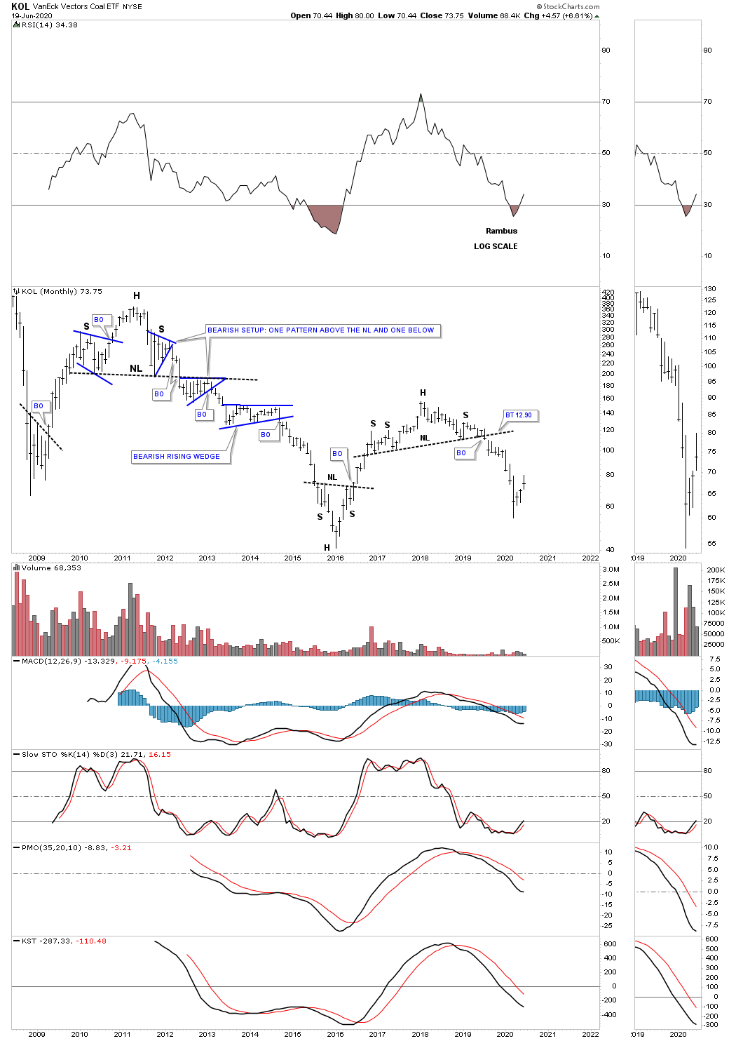
KOL, coal etf, would probably be the last stock in the world that I would ever invest in.
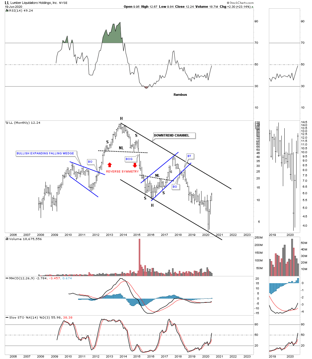
LL, Lumber liquidators, is bouncing off the bottom rail of its 2012 downtrend channel.
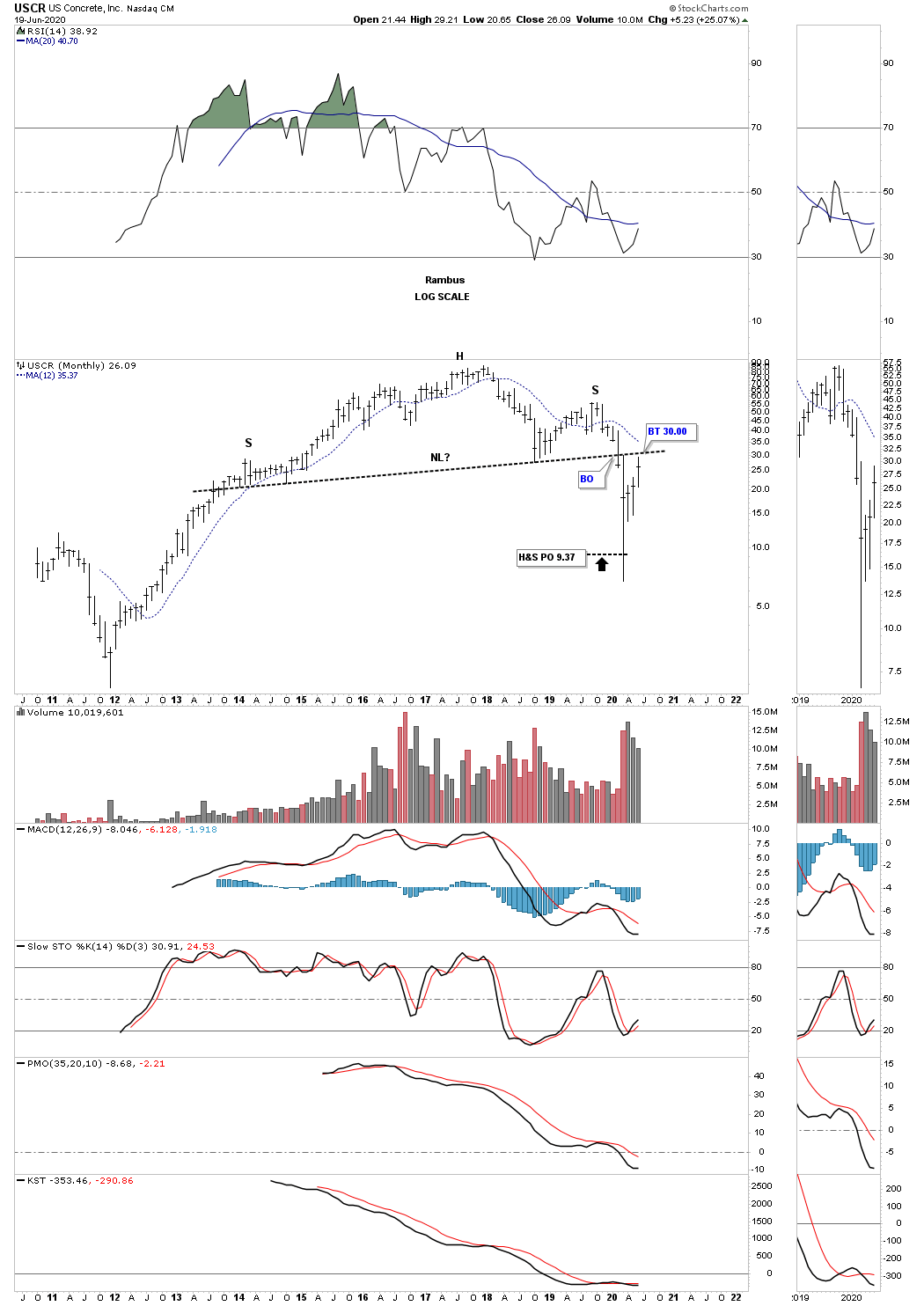
After reaching its H&S price objective USCR, concrete, has rallied all the way back up to its neckline. Since the H&S price objective has been met a breakout above the neckline and then the right shoulder high would be a very bullish setup.
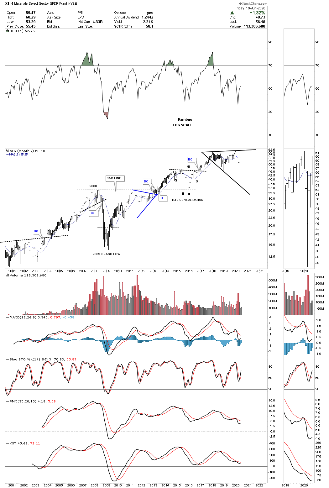
The XLB, basic materials fund, sold off hard during the March crash but has rallied back up close to its all time highs. Like several stocks we’ve looked at today the XLB has also formed a flat top expanding triangle which could be a very bullish pattern if we get the breakout above the top rail that will coincide with the other flat top expanding triangles we looked at. There are a lot of stocks in the XLB that are also in the INDU so these 2 can move somewhat together.
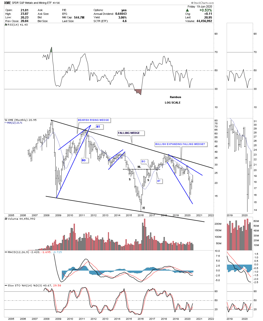
This last chart for this commodities report is the XME, metals and mining fund. This monthly chart shows the entire history the XME and how it has traded in the confines of the falling wedge. It to is building out a possible bullish expanding falling wedge like many other stocks we’ve looked at today. You may also recall there were many bullish expanding falling wedges that were made on many of the PM stocks as well.
If we are seeing the actual bottom in the commodities complex there will not be a bell that rings to let everybody know. The environment at an important low is generally pretty muted with most investors not even remotely aware of what is taking place as their main focus is in other areas. When we put all three parts together for this commodity report I think they paint a very clear picture that if all the pieces come together over the next month or so we will have a heads up on most investors. Time to get this posted and get ready for the Father’s Day cookout. Have a great Father’s Day and all the best…Rambus
US Secular Bull Market Still Intact
Back on June 22nd during the Markets Update post I mentioned that I saw a possible big move coming in the US stock markets that could be bigger than anything we’ve seen in a long time based on what the charts were showing. I said I still needed a few more weeks of chart development before I could confirm the possible move. I still don’t have confirmation just yet but we are getting closer to the inflection point that will signal if what I’m seeing has a chance to come to fruition.
Part 1 : https://rambus1.com/2020/07/05/weekend-report-213/
Before we look at the charts for that possible strong rally I would like to go over the psychological issues many investors have trying to figure out the markets. I’m going to use an analogy that kind of fits the times we are living in. In the stock markets you have the bulls and bears which are in constant battle for domnance and in politics you have the Republicans and Democrats who try to gain power over the other side.
Since the 2009 crash low the stock markets have enjoyed one of the greatest bull markets of all times which is still on going to this day. There are many bears out there that to this day can’t see the bull market that has lasted over 10 years now. It’s their bearish psychology that has kept them on the sidelines waiting for the next great depression to begin. They can give you a list 10 miles long of fundamental reasons on why the stock markets can’t keep going up and have to crash.
During the great bull market of the 1990’s my dad and I would have strong debates on the direction of the markets. My dad who grew up during the Great Depression could never let go of the impact it had on his life even 60 years later. Even during the biggest bull market in history at that time he would use the same fundamentals reasons we are seeing today and totally neglect what the price action was actually doing, going up. Some of our debates got very heated to the point that my mom in the next room would say, you guys knock if off. My dad and I would look at each other and begin to laugh as we knew how far we could push each other but no one else did. My dad passed away at 86 still thinking the next Great Depression was around the corner.
The same analogy applies to politics as well between the Democrats and Republicans. If one is a staunch Republican or Democrat there is very little the opposite party can do to change your mind. You will seek out every bit of information you can find to help support your point of view regardless of what the reality is. This is human nature to find other people to help support what you believe to be true. It’s called running with the herd which in and of itself is not a bad thing as it has played a key role in getting us to where we are today as a society. Running with the herd in the stock markets is a totally different ballgame.
I hear it on both sides of the isle that if a republican wins the election life as we know will never be the same and I hear the same on the other side that if a democrat wins the United States will turn into a communist state where no one will have any freedoms left which is getting down to what this post is all about.
Below is the long term monthly chart for the, History Chart for End of the World, which I post a few times a year. I’ve recently updated this chart to show you what happened during a Republican presidency and a Democratic presidency. What this chart is strongly suggesting to me is that it makes no difference who’s in the White House. What is most important to understand is what is the major trend of the stock market. A president can influence some social trends but when the secular trend for the stock market is in place nothing can stop it unless we have an all out nuclear war.
The green shaded areas show when a Republican is president and the blue shaded area shows when we have a Democratic president in the White House. Starting at the left hand side of the chart at the end of the Carter administration, Regan being a Republican, was voted into office and held the job for 8 years with the stock market enjoying nice bull market but nothing to write home about. At that time he presided over the birth of the technological revolution we enjoy today. It was going to happen regardless of who was president.
Then it came time for Bush 1, a Republican, to take charge of the markets that just traded sideways with an upward bias. During his presidency he had to deal with the 1987 crash and the Saving and Loan crises which is why he was a 1 term president but it wouldn’t have made any difference if it was a democrat in office. As you can see the COMPQ built out a beautiful bullish rising channel or flag that we know is a very bullish pattern, Bush was just in the wrong place at the wrong time.
Clinton on the other hand was in the right place at the right time and enjoyed the parabolic phase of the greatest bull market of all time. It could have just as easily been a Republican that got all the credit. Bush 2 came into office at the end of the secular bull market that ended in 2000 and had to deal with the first leg down of the new consolidation phase that was needed to correct the secular bull market that began in 1974. He did experience a rather lackluster rally into the 2007 high which produced the banking and housing crisis. The stock market still needed more time to consolidate that 25 year secular bull market so we got the bear market into the 2009 crash low which at the time was called the worst bear market since the Great Depression. Looking at the 2009 crash it really didn’t live up to its exceptions of the Great Depression that most analyst were calling for. Bush 2 probably had the worst timing a president could have coming into office at the end of a 25 year secular bull market and leaving office at the end of an 8 year correction that was needed to begin a new secular bull market which is still underway.
Like Clinton, Obama came into office at the most opportune time right at the end of the 8 year bear market as shown by the massive blue triangle consolidation pattern. The Republicans will say that Trump has created the greatest economy our country has ever seen but when you look at the reality of this chart he just took the baton from Obama like every other president in history. It wouldn’t have made any difference who was elected as the 2016 correction was coming to an end. I still remember when Trump was elected president the Democrats were beside themselves as the stock markets were going to crash under his leadership. Even under Trump’s leadership with the coronavirus and one of the biggest stock market crashes in history the COMPQ is trading at a new all time. How can that be you may ask? Its because we are in a secular bull market that began in 2009 and still has many years to run before another long term bear market has its turn to chop investors up.
The point I’m trying to make is that it makes no difference who is president during a secular bull market.
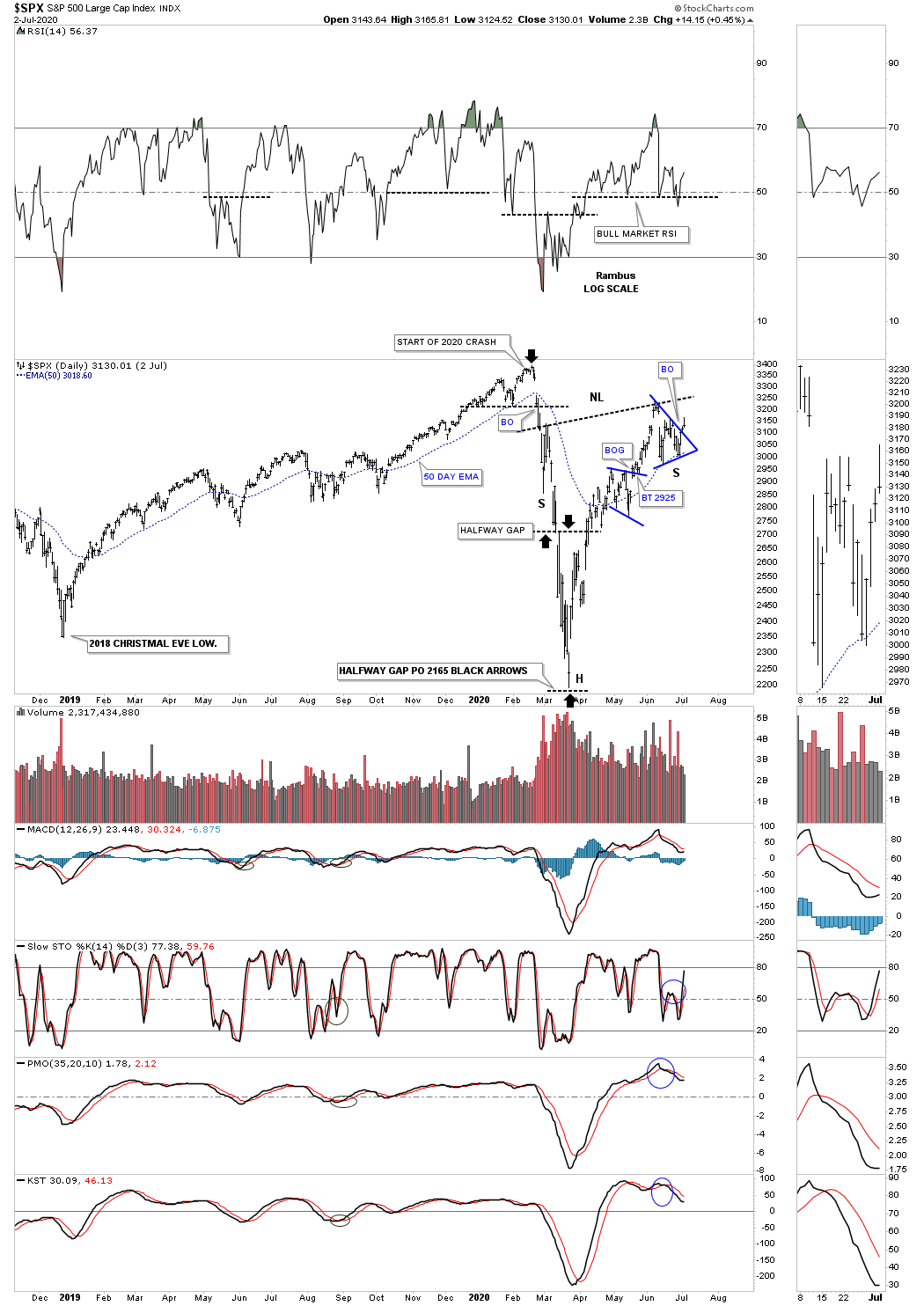
So what does a secular bull market look like? Below is a 75 year quarterly chart for the SPX we’ve been following since the breakout from its massive flat top triangle consolidation pattern in 2013 when just about every other US index and world stock markets broke out of their respective massive consolidation patterns. This big picture look shows no signs of ending anytime soon. We just experienced one of the biggest crashes in the history of the stock market and still the SPX is trading not to far off of its all time highs.
For those that haven’t seen this chart before you can see the last massive consolidation pattern, the bullish rising wedge, which formed as a resting area for the secular bull market we just looked at in the, History of the End of the World chart above. Note the blue shaded areas that formed during the 1987 crash and the current one that shows the 2020 crash. The blue shaded area rectangles measures height only and not time. The initial rally out of the 1970’s bullish rising wedge to the top in 1987, just before the crash, is almost identical to the height of of the 2020 high before our recent crash that many believe we are still in. If we are truly in a secular bull market which is where my money is we won’t see the 2020 crash low ever again.
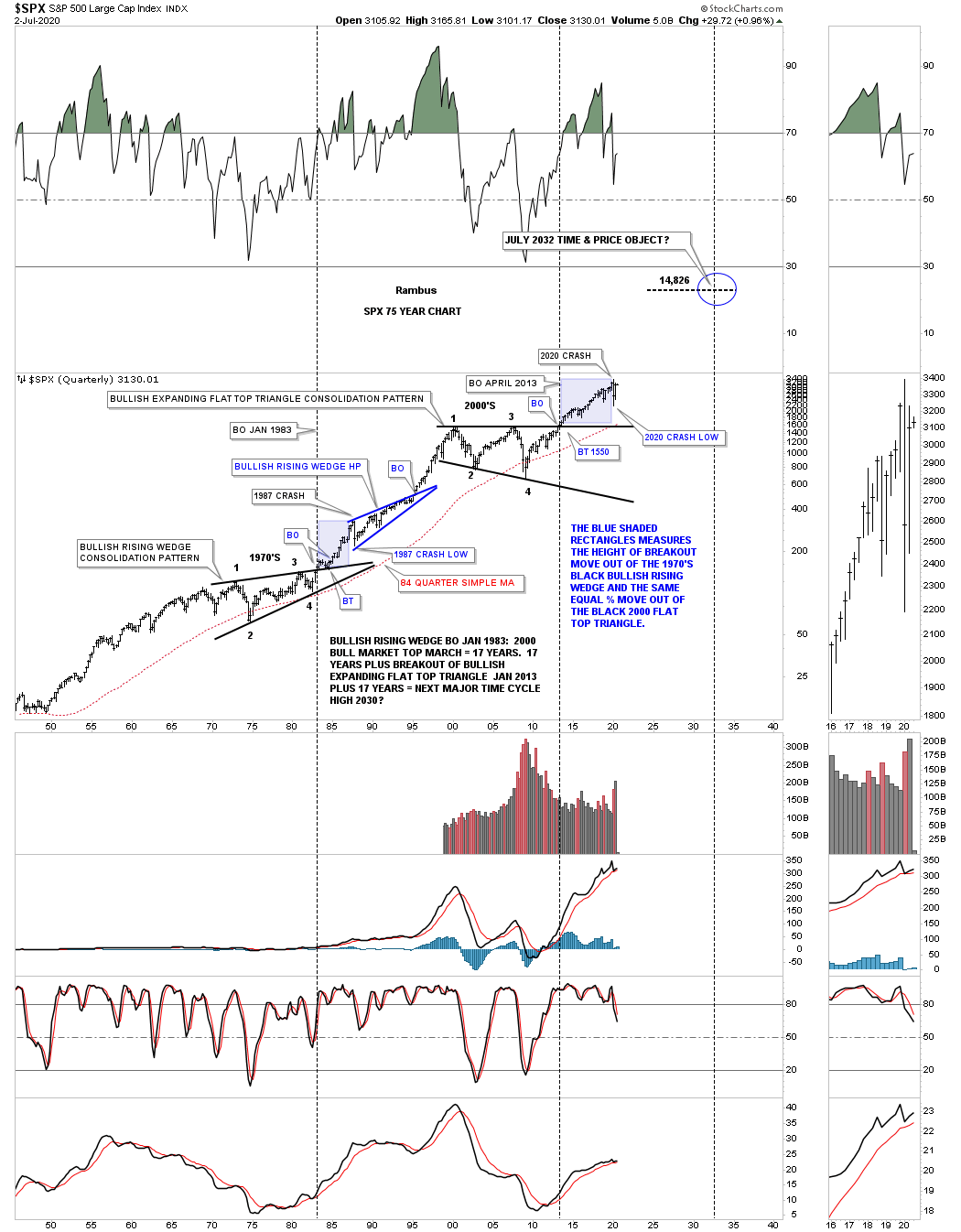
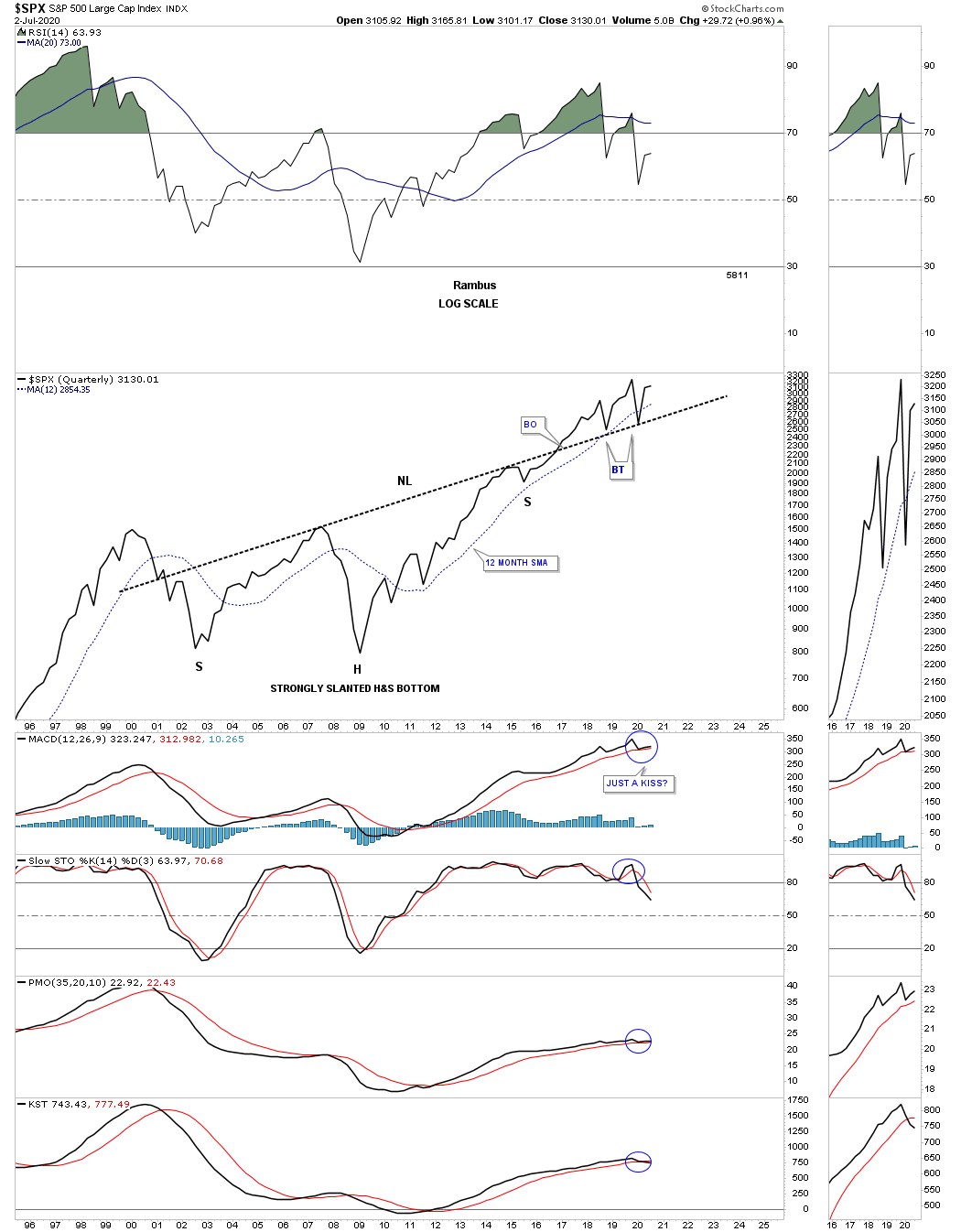
This next chart I built several years ago waiting for the strongly slanted H&S neckline to be broken to the downside but every time the price action gets near it a strong rally ensues. The latest touch of the neckline was the 2020 crash low and the neckline held once again.
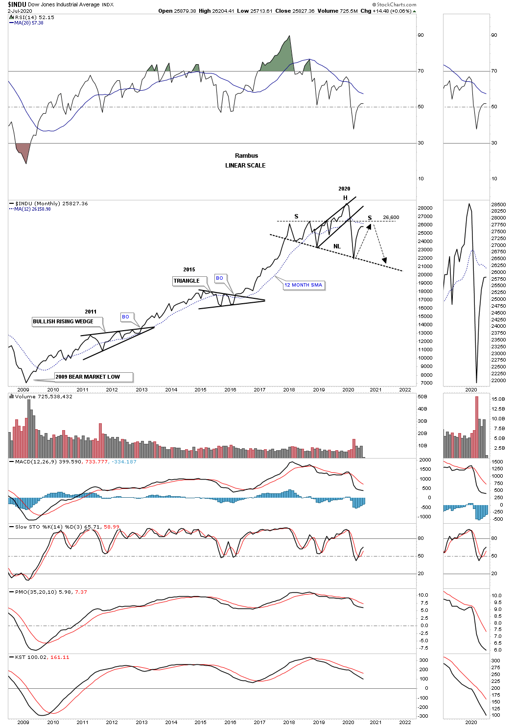
This next chart is for the INDU which shows the Chartology of its secular bull markets. Note the 1970’s massive H&S consolidation pattern that was needed to consolidate the previous secular bull market leading into the 1970’s consolidation pattern. What confirmed the 1970’s H&S consolidation pattern was authentic was the very clean breakout and backtest to the neckline. As hard as I try I can’t find anything bearish from this long term perspective.
I coined the name, Jaws of Life, after most analyst were calling it the Jaws of Death and looking for the markets to crash. You can also see the clean breakout and backtest to the top rail of the Jaws of Life that worked out very well. I have to say that the backtesting process was very laborious as many of our members at the time can confirm. It seemed like the backtesting process would never end but nothing was ever broken so here we are today. Here again like the 75 year quarterly year chart we looked at earlier on the SPX 75 year quarterly chart, you can see how similar the 1987 and 2020 crash look. Note how close the 2020 crash came to completely backtesting the top rail of the Jaws of Life before moving higher.
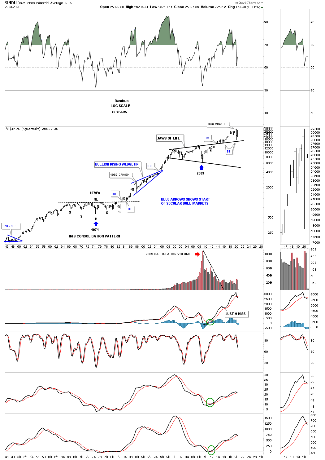
I’m constantly looking at both sides of the coin when it comes to what is possible when it comes to the markets. This chart is one for the bears.
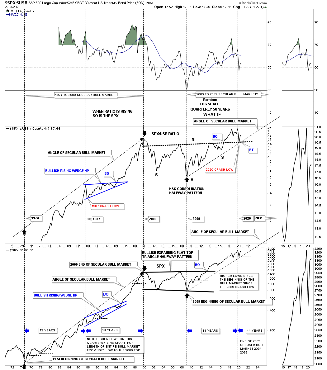
Before we move on to the shorter term charts there is one more 50 year quarterly ratio combo chart I would like to show you in regards to the secular bull market. The ratio chart on top compares the SPX to the USB, 30 year bond, with the chart on the bottom being the SPX. There is really a lot of information on this combo chart but the main takeaway is that when the ratio chart on top is moving higher so is the SPX, they really have a pretty good correlation. On the left side of the chart you can see the secular bull market that ran from 1974 to the 2000 high in both the ratio and the SPX which began a multi year consolidation phase. Now look at the beginning of our secular bull market that began in 2009 and you can see the exact same thing happening again. Even the 2020 crash low has held support above the previous quarterly low.
The SPX formed the 2000 flat top expanding triangle as its halfway consolation pattern but the ratio chart on top formed a large H&S consolidation pattern that I’m viewing as a halfway pattern. Note where the 2020 crash low found support, right where it needed to on the backtest to the neckline. There is other information on this chart that I don’t have the time to go into right now but there is one last thing I would like to point out to you. Starting at the very beginning of the last secular bull market that started in 1974 note how the price action never traded lower than the previous quarterly low for the entire bull market, as shown by the thin black dashed horizontal lines on the SPX.
This is what I wrote on June 22nd of this year:
Before we look at today’s charts I would like to give you a short answer on why I’m taking on many positions in the stock markets. The short answer for now is that I recently had an epiphany moment similar to the one I had on the US dollar back in 2014 when I discovered that massive 11 year base that was a fractal to the one that formed previously that most of you have seen many times.
Currently I’m seeing some patterns setting up in the stock markets that could lead to a very powerful rally the likes of what we’ve never seen before. I realize that many think I’m living in a fantasy land by being bullish on the stock markets which is fine because I don’t want to run with the herd. I want to go where no man has gone before. That sounds like a movie title.
The bottom line is that I need to see a little more price action which could happen fairly quickly over the next couple of weeks to come forward with what I think could happen. The kicker is that the PM stocks will go along for the ride. I’m posting this today so I’ll be on record if indeed what I’m seeing plays out. It will mean nothing after the fact.
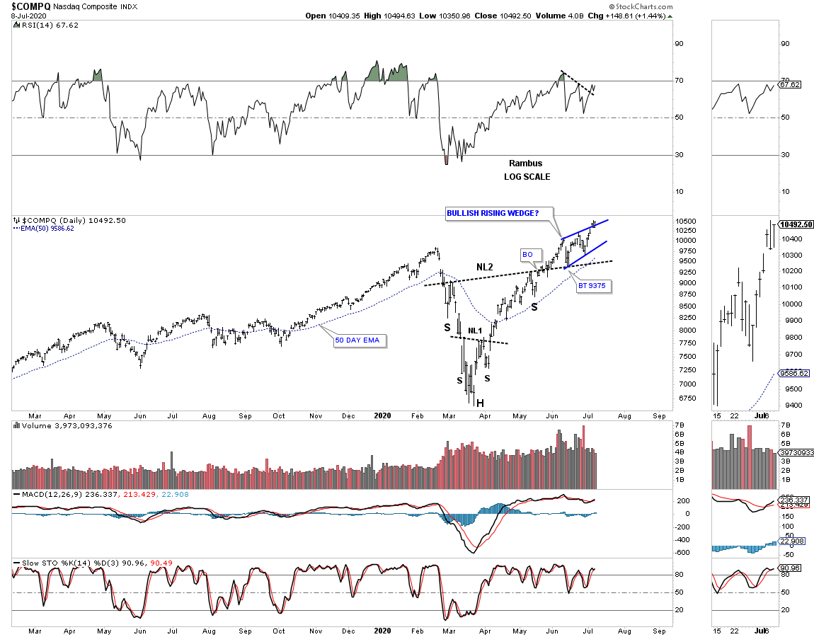
So here we are July 5th. I still don’t have confirmation yet but the time is drawing near for an answer one way or the other. Starting with a short term daily chart for the SPX you can see a possible double H&S bottom with the right shoulder still under construction with the possible blue triangle being the right shoulder. Why do I think we could see a rally of epic proportions? The answer lies in the fact that we just experienced one of the biggest stock market crashes in history. When you look at this possible H&S bottom there in nothing that makes you go WOW, It looks like just another H&S bottom.
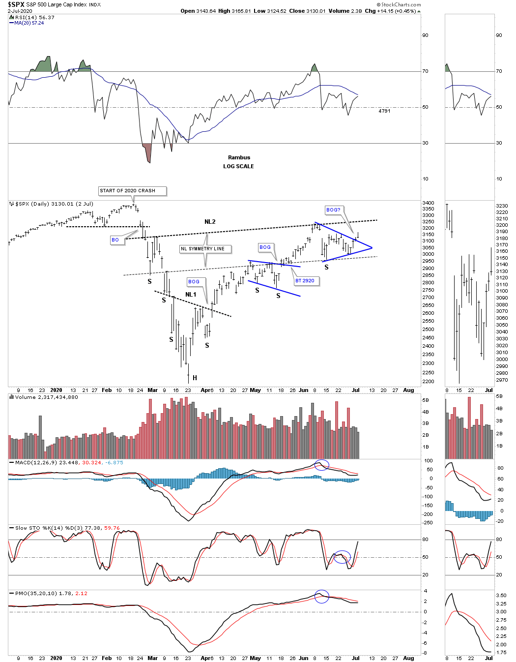
Now I would like to put that possible double H&S bottom on the chart above in perspective going back to the beginning of the last impulse move up that started at the 2018 Christmas Eve low. What if we are looking at a massive H&S bottom that no one else is seeing? When I see a near vertical move down like the 2020 crash showed us I automatically start looking for reverse symmetry to the upside. If you measure the height of the possible H&S bottom to the neckline and add that distance to the breakout point you will see a pretty high price objective. Since the possible H&S bottom didn’t take that long to form symmetry suggests the move to the upside will be fast and furious as well. Even if the H&S bottom doesn’t work out like I think, you can still see bull market price action especially if the blue triangle completes as the second consolidation pattern with one consolidation pattern forming on top of the previous one.
Next is the short term daily chart for the INDU which shows its possible double H&S bottom and where the 2020 crash began. Again nothing special looking about this double H&S bottom.

This longer term daily chart for the INDU shows you how the 2019 impulse move came to an end. I was extremely bullish going into the all time high as there were no reversal patterns or anything else negative within the 2019 impulse move. I first became aware that the 2019 rally was running out of gas was when I noticed the possible double top forming. Once I saw the big gap to the downside I put out an alert that now might be a good time to go to cash as we had some decent profits on the books. I remember saying, I was going to hang on for one more day to see what would happen. What happened was the very next day we got a hard move to the downside to where the left shoulder of the possible H&S top begins which was my signal to get out of town. That move also took out the bottom rail of the 2019 bearish rising wedge. I also remember saying after the breakout from the 2019 bearish rising wedge that the price objective of a rising wedge is down to where the rising wedge began to form which was the December 2018 low.
There is another piece of Chartology that you may have noticed on many of these charts and that is the halfway gap that showed up in the middle of the crash. I wasn’t smart enough to notice it in real time but I did notice a couple of days after the crash low was in. Once I noticed it I had a very big clue that it was a halfway pattern to the downside. I mentioned that we may have just seen the lows for this crash based on the halfway gap. The halfway gap showed up on almost every stock market index and a few other areas of the markets.
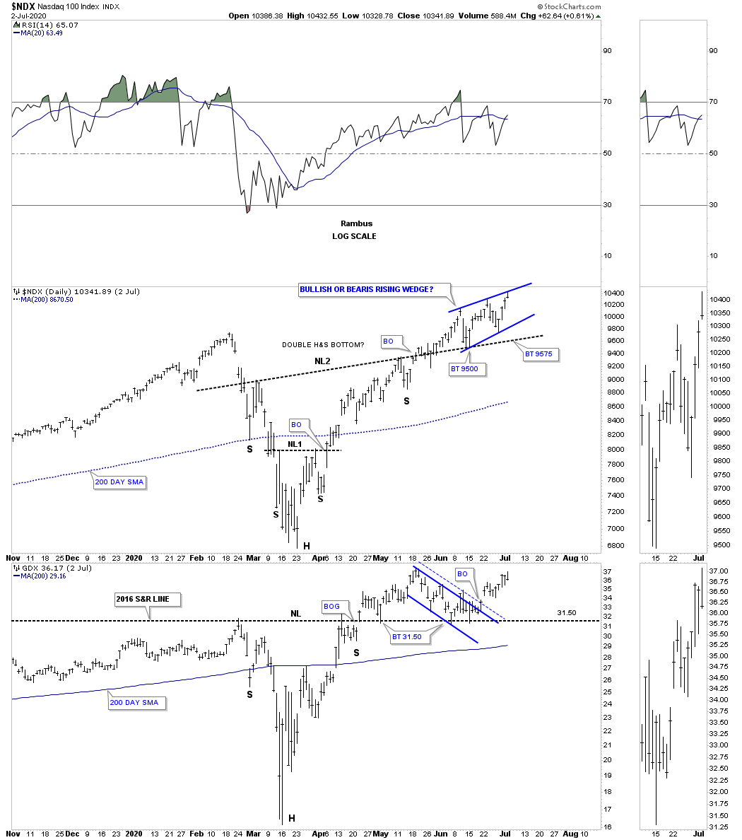
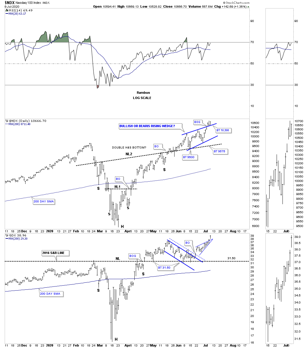
Here is where it starts to get interesting. The NDX on top has been one of the strongest sectors within the stock markets. As you can see it has already broken out of its H&S bottom and is forming a rising wedge on top of the neckline. Whichever direction that rising wedge breaks out will be our big tell. If it breaks out to the upside then I will be right but if it breaks to the downside what I’m seeing right now will be wrong and I’ll have to go back to the drawing board. Note how closely the GDX is tracking the NDX which is why I think they will both be going up together. The last point to make on the NDX chart is last Friday’s price action. You can see how the NDX hit the top rail and backed off into the close. That tells us the top rail is hot and properly placed.
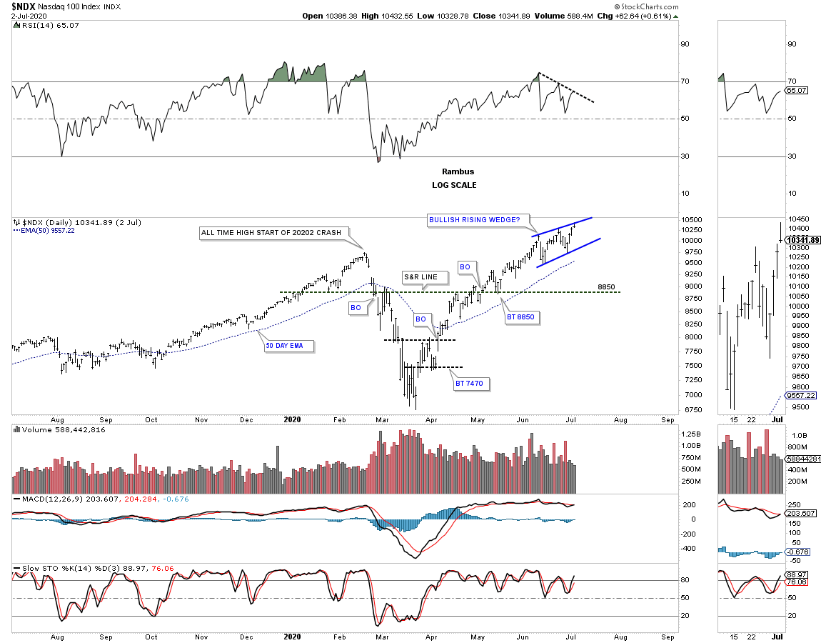
Below is a longer term daily chart for the NDX. Focusing in on the RSI at the top of the chart you can see what looks like a negative divergence to the blue rising wedge. Understanding what creates a bullish rising wedge you want to see a negative divergence which is a hallmark of this pattern. What happens is the indicator work off their over bought level while the stock continues to move slowly higher. The rising wedge is also called a running correction by other analyst.
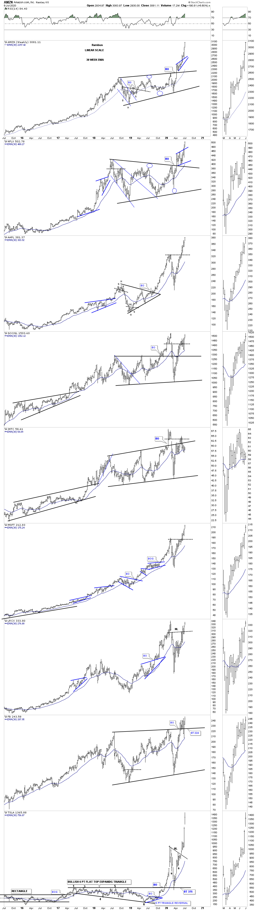
I still have so many more charts to show you but it is getting late so for now I want to leave you with a combo chart for the big cap tech stocks. We just finished looking at the rising wedge on the NDX chart above wondering which direction the breakout will occur. I think we are getting our answer by what AMZN and NFLX are showing us. LRCX is now breaking out of its H&S bottom similar to the ones we looked at tonight on the stock markets. If anyone bought TSLA I hope you are enjoying your new ride.
If you can look at this combo chart and tell me with a straight face that this looks like bear market action then there is no hope for you. You will remain a hardened bear until the beginning of the next bear market whenever that might be and then you will be finally proven right. I will post some more charts in the Wednesday Report which are offering some good clues that the secular bull market is alive and well.

Prosperity as Far as the Chartology Can See : Secular Bull Market Part 2
Tonight I would like to finish up with the long term secular bull market we discussed in the Weekend Report for the US stock markets. Long term secular bull markets just don’t begin and end for no good reason. There has to be a catalyst that drives the markets higher over a long period of time.
Part 1 : https://rambus1.com/2020/07/05/weekend-report-213/
When the previous secular bull market began at the 1974 bear market low no one could have imagined then what was about to take place over the next 25 years. The news from a fundamental perspective couldn’t have gotten any worse which is the case at an important low. Even during the first 10 years of the bull market no one could have known that one of the greatest bull markets of all time lies ahead except for maybe a few tech geeks who understood some of the technology that was being born.
The 1980’s was the birth of a new technological revolution that everyone takes for granted today. Computers were only for big corporations that had the man power and money to run them. The average person in the early 1980’s may have heard of computers but the internet, what is that? Again, the average person back then didn’t have a clue of how the new technological revolution was going to change their life.
There were stocks likes MSFT, Dell Computer, CSCO and a host of other stocks too numerous to mention that began life as an embryo back then. By the time the 1990’s rolled around some of the winners like AAPL and MSFT for instance started to become familiar names in the trading community. I can’t remember how many times I traded in and out of APPL and MSFT not having a clue of what they would eventually become.
As the 1990’s wore on more and more names in the tech sector became better know to the average investors. People were finally beginning to realize that something major was taking place that was going to change lives in ways no one back at the bottom in 1974 could have imagined. Once the realization sunk in that life as we knew it was going to profoundly change the way we do things began the bubble phase that lasted from 1995 to 2000.
During those last 5 years was the craziest times to be an investor. Every week a new IPO would come to market which was advertised to open up at say $25 but on the day the IPO became public it would open up over $100 dollars or higher. This went on for most of the 5 year parabolic run into the 2000 top. Many of the new IPO’s had no earnings or had any prospects of having any earnings that were bid up into the stratosphere on pure speculation. It was that mania phase that I’ll never forget. We haven’t even come close to those days in our current secular bull market.
For me personally, there was a chip stock that had a patent that was going to make this company more money than anyone could imagine. They were going to get royalties from just about ever chip maker in the world or so the story goes. In the last 2 years of the bubble phase I traded this stock called, Rambus, exclusively. It would go up and double and then split 2 for one and then go right back up again and split again. If you think the junior miners can be volatile they don’t even come close to what Rambus, the chip stock was doing. The end came for me in early 2000 when RAMBUS the chip stock, more than doubled and then split 4 for 1 taking the price back down into the mid 50’s. In a matter of a couple months it had almost tripled and got up to the high 130’s where this time I wasn’t going to take any chances and called my broker, because online brokers were just being born. I put in a hard sell/stop in the high 120’s and let the chips fall where they may. It was just a couple weeks later that my sell/stop was hit and as they say, the rest is history.
That was a life changing experience for me that allowed me the financial freedom I still enjoy to this day. It wasn’t easy as the volatility could be massive but the Chartology never let me down. Big gains don’t come from being timid in the stock markets.There is a time to be cautious and then there are times to be aggressive. Knowing which one, comes with time. I’ve had 5 life changing events the stock market has offered me and in each case I had to be aggressive to get the results I was looking for. Please keep in mind this is my psychological makeup and is NOT for everyone.
Now I would like to discuss our current secular bull market that began at the 2009 crash low. If you were trading the stock markets back then you know it felt like the end of the world and the next great depression was upon us. Most investors that got caught in that bear market were scarred for life and will never trust the stock markets again. They will never be able to look at the stock markets objectively ever again. When we get to the mania phase of our current secular bull market they will finally give in and feel it is safe to start trading again because the profits will be too big to ignore. Same story but different time frame.
Everybody knows the FANG stocks now like the back of their hand but I can assure you that there are going to be new FANG type stocks that are just being born right now as we speak but very few investors have a clue of who they are right now. As time goes on they will start to emerge from the darkness one by one until they become a household name. The key is to understand the new technology that is going to change our lives in ways we can’t comprehend right now.
Our current secular bull market is now over 10 years old and we should start to see the emergence of some of the companies that are going to lead us into the future. The last secular bull market was the birth of technology which had a profound impact on our everyday lives. The current secular bull market is also going to change our lives in ways we can’t even imagine yet. Artificial intelligence, robotic, super computers, to name just a few. Then there is the biotech arena that is going to find a cure for cancer, heart disease, and extending the average lifespan again, to just name a few. There will be new technologies that we can’t even comprehend right now that are going to emerge from the shadows of the new technologies that are just getting their feet wet.
I probably seem naive to many of the harden bears that can only see the dark side of life and politics that so permeates our society right now. Even with all that is going on right now in the world it will not change the evolution of the profound changes that are coming our way whether we like it or not. It’s these new technologies that are driving this secular bull market that can’t be stopped no matter how hard we try. The human species is the only animal on the planet that keeps on improving life for the better which is part of our DNA. Just think of how much progress we’ve made in the last 100 years. Now with super computers and artificial intelligence the speed at which change comes will be much faster than most can imagine. Anyway my cup is always half full regardless of all the negativity that we are seeing all around us.
Lets look at a few more charts which are suggesting that our current secular bull market is not dead yet. This first chart is the daily look at the COMPQ which is backtesting the top rail of its blue bullish rising wedge.
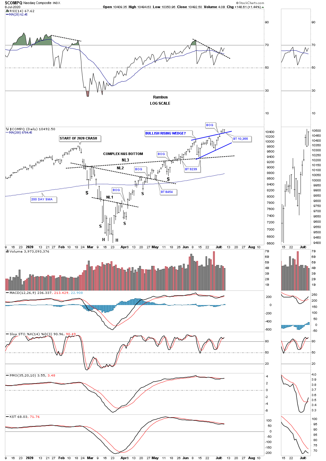
The longer term perspective with the blue rising wedge forming the backtest to the neckline.
Below is the NDX and GDX combo chart we’ve been following which shows a pretty positive correlation taking place.
Below is a daily combo chart which has some FANG stocks with GLD on the bottom. Again some pretty close positive correlation.

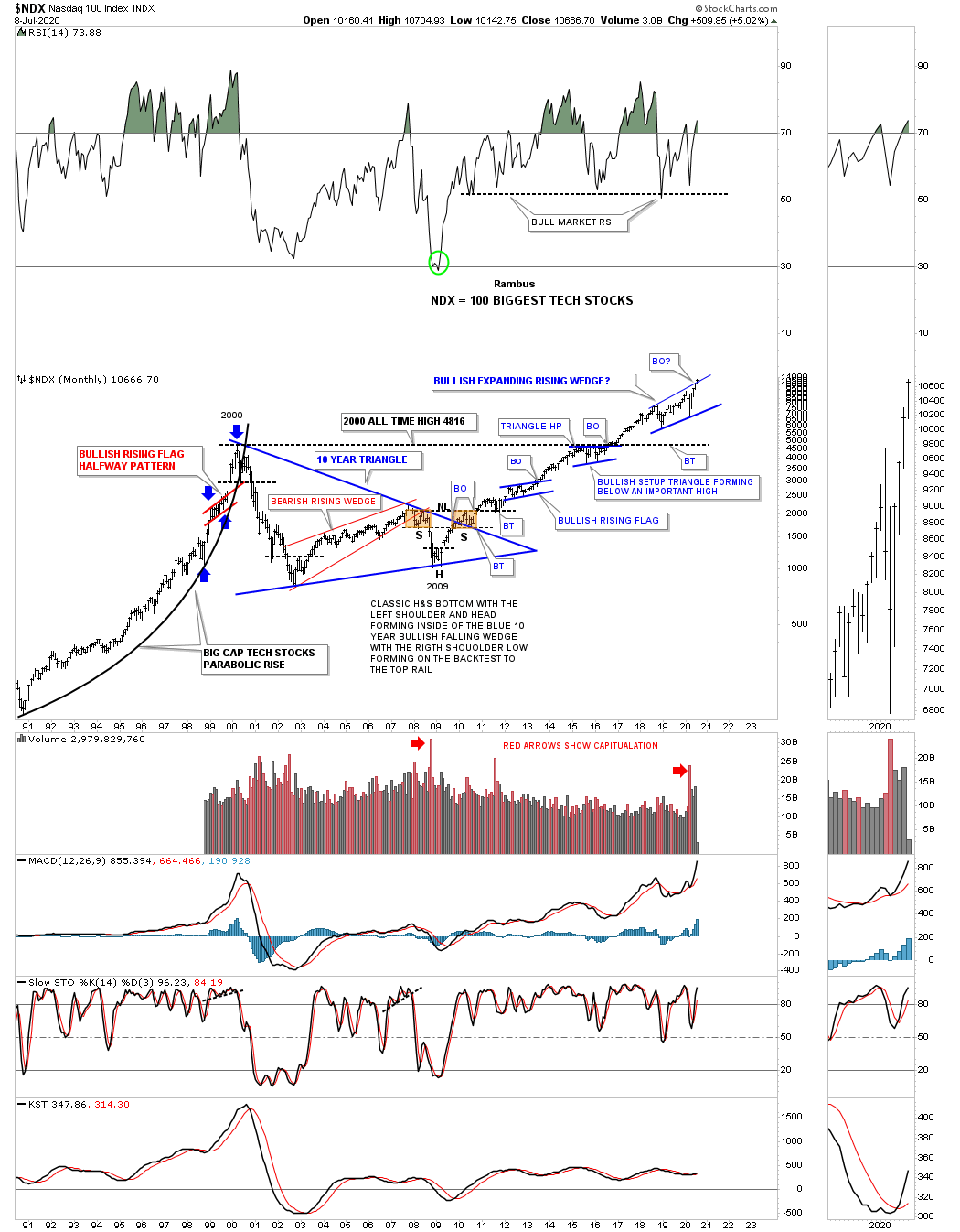
Is this long term monthly chart for the NDX showing us just another consolidation pattern in the 2009 secular bull market? As you can see the price action has completed the all important 4th reversal point. Note the capitulation volume at the 2009 crash low and the 2020 crash low.
The long term daily chart for the SOX.

The long term weekly chart for the SOX for perspective.
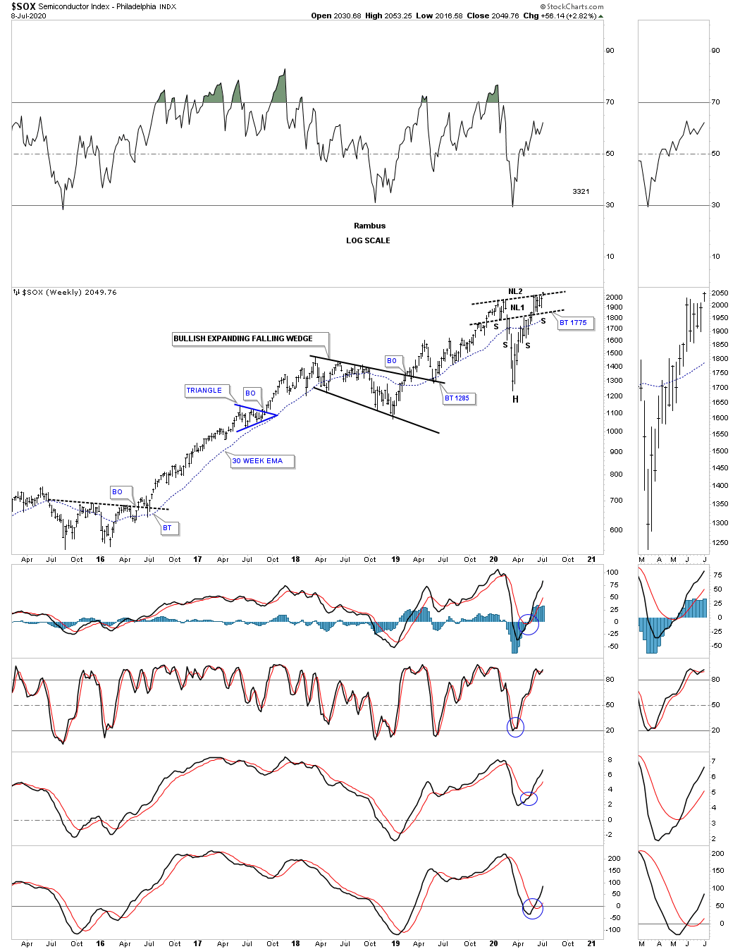
What is the difference between these black consolidation patterns vs the ones we’ve been following in the PM complex? Nothing.
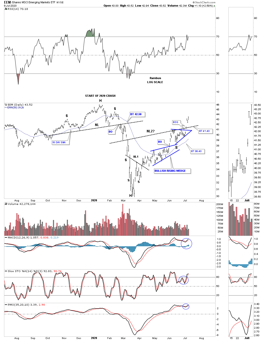
We are not going to be the only stock market that continues to moves higher as this secular bull market takes hold. Monday of this week the EEM, emerging markets, gapped above its double H&S neckline.
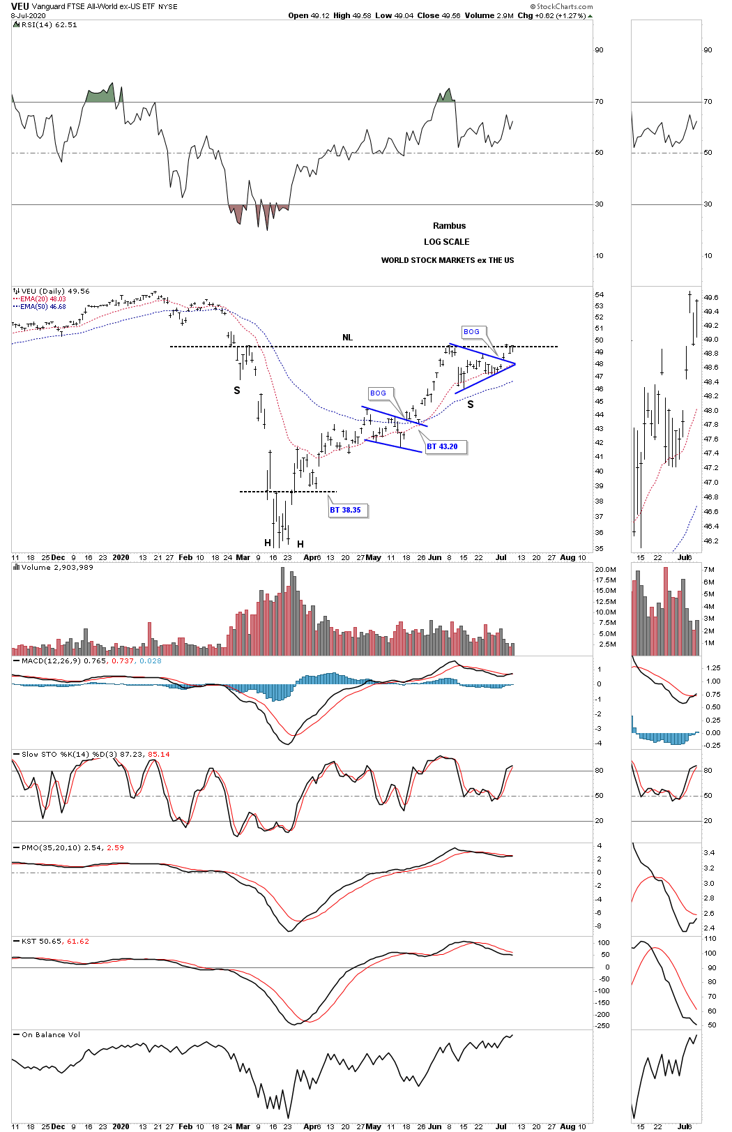
Next is the VEU, all world stock markets ex the US stock market. After breaking out of its right shoulder blue triangle the price action is now testing the neckline.
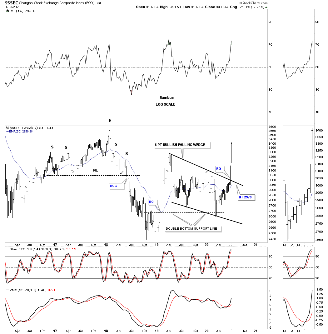
The SSEC, Shanghai stock market, has come to life over the last 2 weeks.
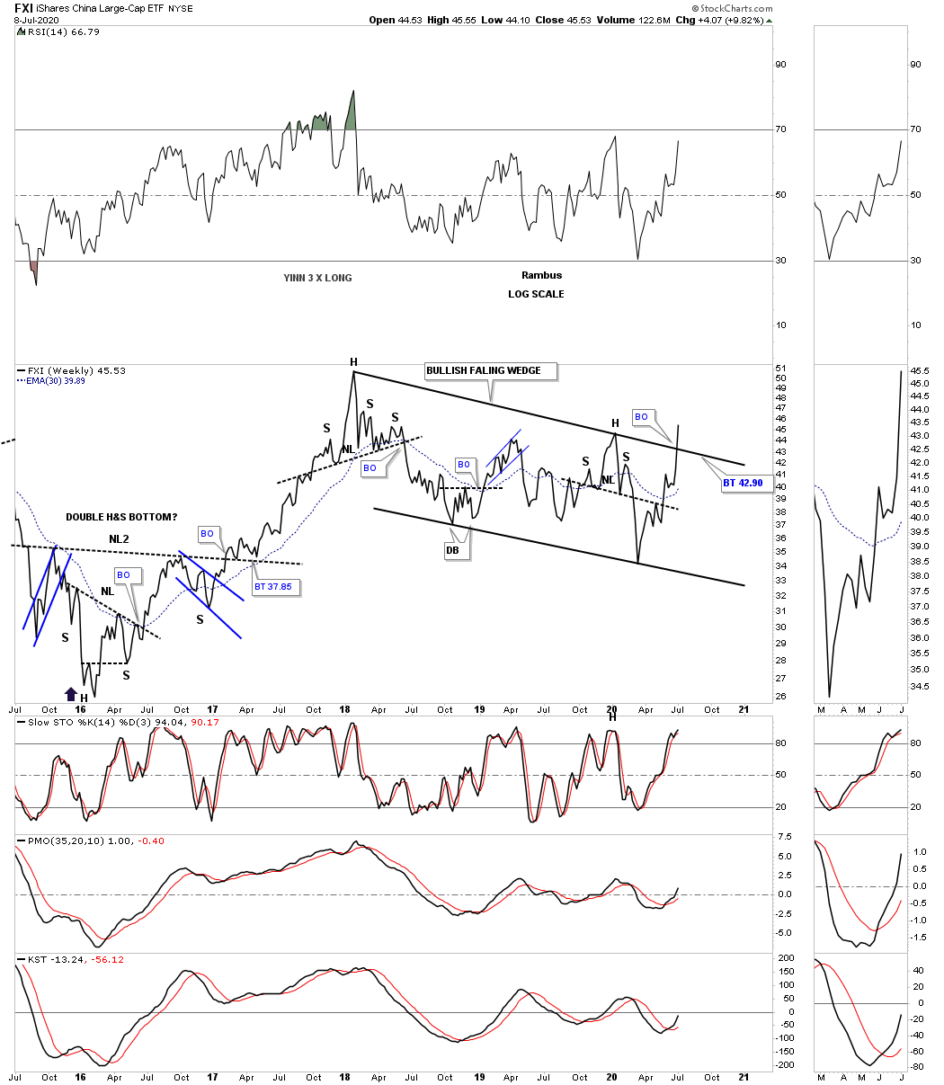
The FXI is the China big cap etf which is breaking out from its bullish falling wedge.
The NIKK is slowly getting close to the the top rail of its flat top expanding triangle.

The ITB, US home construction etf, has broken out of the possible right shoulder triangle.

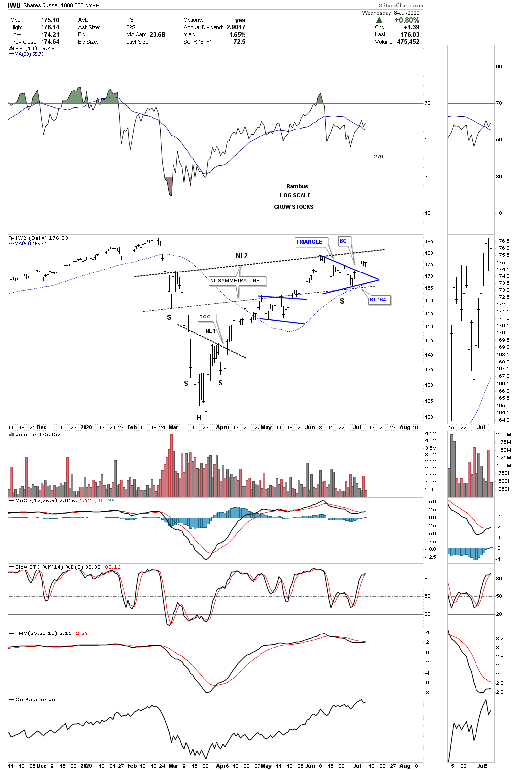
The IWB, Russel 1000 growth etf, has broken out of its possible right shoulder triangle consolidation pattern.
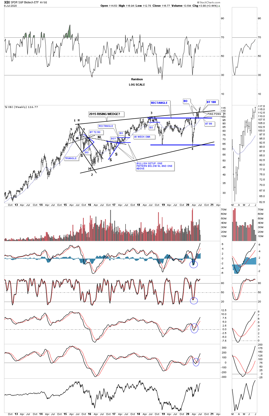
This weekly chart for the XBI, biotech etf, is still producing some great Chartology with the breaking out and backtesting of the important trendlines and making a new all time high today.
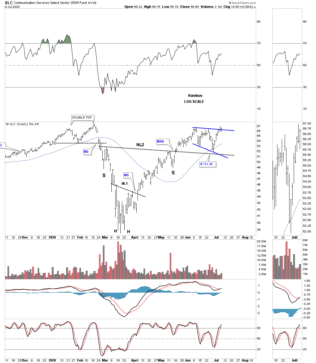
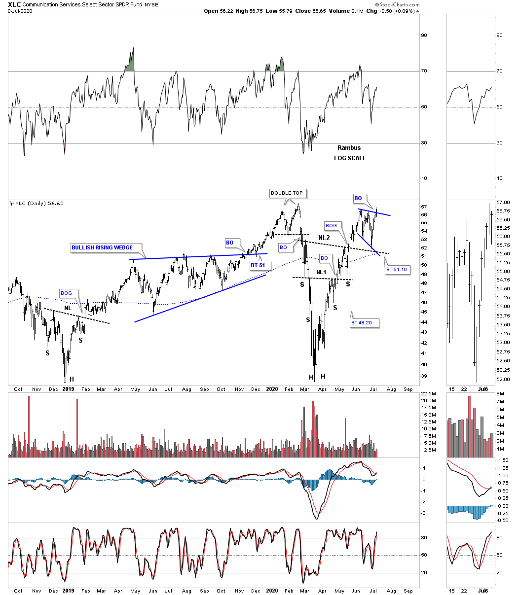
This daily chart for the XLC, Communications service fund is breaking out from its bullish expanding falling wedge as the backtest to neckline #2.
The long term daily chart for perspective.
Just like many of the right shoulder triangle patterns we’ve looked at tonight the XRT, Retail etf, broke out of its possible right shoulder triangle late last week.

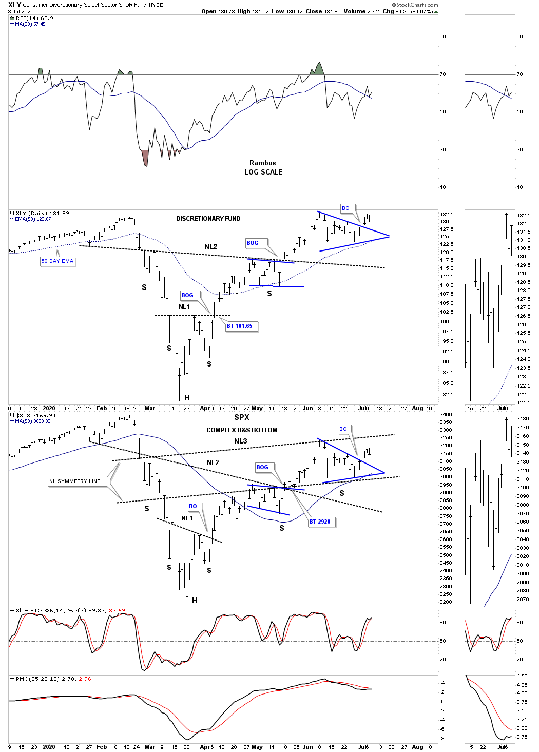
This last chart for tonight is a combo chart which has the XLY on top with the SPX on the bottom. Normally when the XLY is doing good so is the SPX.
So far there is nothing in the charts that is suggesting the end of the secular bull market that began at the 2009 crash low. We will have more confirmation when many of these potential H&S bottoms finally breakout above their necklines. Once that occurs there should be no doubt in our minds that the next impulse leg in the secular bull market is truly underway.
Related Reading:
- Rambus: Blockbuster Chartology – May, 2020
- Rambus: Blockbuster Chartology – January, 2020
- Rambus: Blockbuster Chartology – October, 2019
- Rambus: Blockbuster Chartology – July, 2019
- Rambus: Blockbuster Chartology – April, 2019
- Rambus: Blockbuster Chartology – January, 2019
- Rambus: Blockbuster Chartology – October, 2018
- Rambus: Blockbuster Chartology – July, 2018
- Rambus: Blockbuster Chartology – April, 2018
- 2017 Annual Wrap Up – Does Your Pension Fund Have A Deep State Drain? – January, 2018
- 1st Quarter Wrap Up 2018 Web Presentation
- Blockbuster Chartology with Rambus – October, 2017
- Blockbuster Chartology with Rambus – July, 2017
- Blockbuster Chartology with Rambus – May, 2017
- Blockbuster Chartology with Rambus – January, 2017
- Blockbuster Chartology with Rambus – October 20, 2016
- Blockbuster Chartology with Rambus – July 21, 2016
- Blockbuster Chartology with Rambus – April 21, 2016
- Rambus: Are We in a Deflationary Spiral? – January 28, 2016
- The Dollar, Gold & the S&P 500 with Rambus – October 15, 2015